Alfa Upgrades
A website introducing pipeline safety strategies to technical teams.

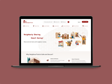
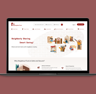
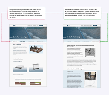
This case study showcases my end-to-end responsive design process for the ALFA Upgrades website, a B2B platform introducing an innovative pipeline protection technology called Geobuffer. The project involved transforming complex engineering content into a clear, engaging, and user-friendly digital experience. I collaborated closely with technical experts to craft a narrative that balances technical accuracy with accessible storytelling, while prioritizing visual clarity and usability. The final product helps ALFA Upgrades communicate their mission, technology, and real-world impact to industry stakeholders.
Project Overview
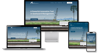
FINAL DESIGN
DESIGN PROCESS
Where We Started
Solving with Design: Research-Led Strategy for a Visual and Technical Challenge
Designing the ALFA Upgrades website came with a unique set of challenges rooted in both content complexity and visual limitations. As a platform introducing a highly technical product to a specific professional audience, the site needed to be clear, credible, and visually engaging, all without the typical marketing assets most websites start with.
When Alfa approached us, they had a new product but no structured way to communicate it online. Their existing materials were highly technical, with dense papers, AutoCAD files, and complex diagrams, making it difficult for non-specialists to grasp the technology. Our first challenge was to organize and simplify.
WHAT IS THE PROBLEM?
Problem #1 Organizing Dense Information Without Overwhelming Users
Building a Clear Information Architecture from Market Insights, Client’s Expertise and Usability Testing
Using Competitor Insights for Navigation and Homepage Strategy
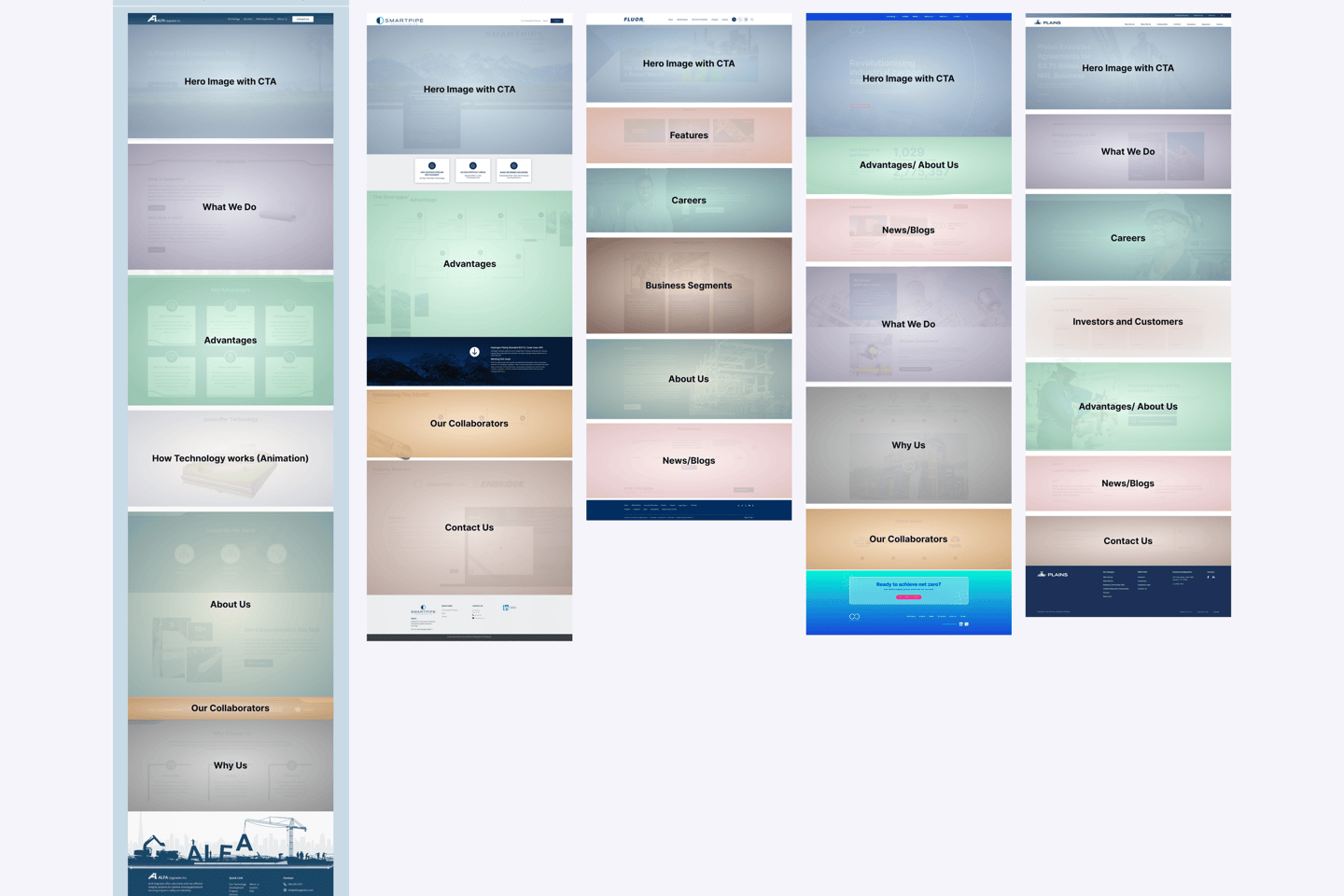
To guide the design of a new platform for a startup with no existing website, we started with a competitive analysis of similar industry websites to understand how they present large bodies of information. This helped form our initial information architecture, ensuring the content was broken into digestible, purposeful sections.
COMPETITOR RESEARCH INSIGHT
Approach
General Evaluation
We studied how similar companies organize their websites, focusing on homepage hierarchy and key offerings. This helped us structure ALFA Upgrades’ homepage with familiar content blocks, like “What We Do”, “Technology”, and “Collaborators”, while highlighting the uniqueness of the Geobuffer system.
Segmented Evaluation
We analyzed navigation, technical content, and visibility of services and case studies. This guided our navbar design, highlighting key pages like 'Technology' and 'Projects' early to build trust and improve findability.
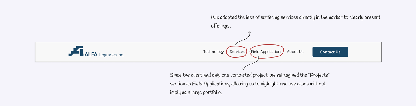
Putting Services in the top navigation made it easier for users to find.
Showing Projects/Case Studies built trust by highlighting real work.
Some competitors hid service details too deep in the site, making it hard for users to find.

Strengths Across Competitors
Common Gaps and Weaknesses
How It Shaped Our Navbar
How It Shaped Our Navbar

Designing Clearer UX for Technical Content with Stakeholder Input
Once the initial information architecture was mapped out, we developed a mid-fidelity design and worked closely with the client to confirm the accuracy of each section. Given the technical nature of the content, this step involved several rounds of review and refinement. Once finalized, the first mid-fidelity prototype was ready for usability testing.
WIREFRAMING
Refining Service page:

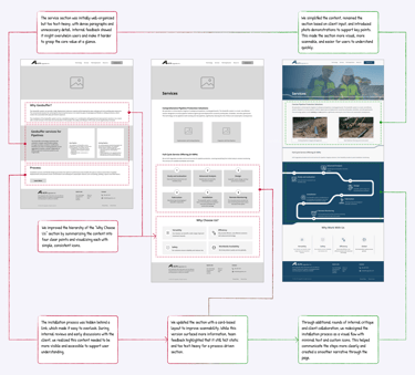
Turning the Information Architecture into Tested, User-Approved Designs
Through multiple rounds of usability testing with our target users, including engineers and professionals with industrial backgrounds, we gathered feedback and made several key iterations. These refinements helped us finalize the structure of the website. Below, I highlight a few of the most impactful changes made during this process.
USABILITY TESTING
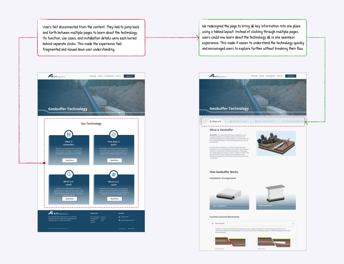
Problem #2 Making a Complex System Understandable
Visual Storytelling for Instant Understanding
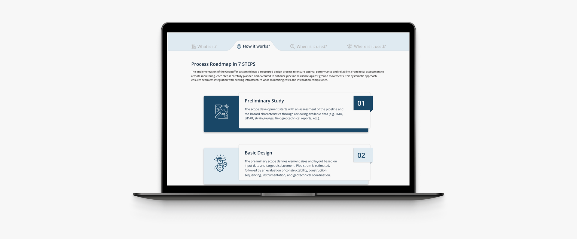
Process
Even with the right structure in place, we needed to make sure the technology itself was easy to understand. Since Geobuffer is a new and complex system, clearly communicating what it does, how it works, and why it matters was essential to the site’s success.
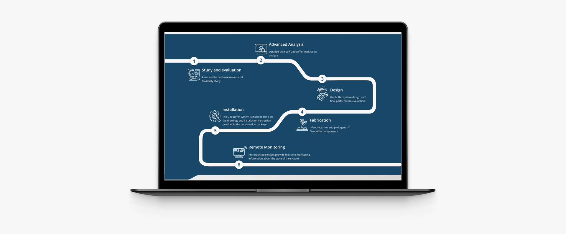
To make this easier for users, we leaned heavily on visual storytelling. We designed an interactive hero image to introduce Geobuffer at first glance. Custom icons were developed to guide users through each section, making the content easier to follow. We also brought in GIFs and subtle animations to demonstrate how the system works, helping simplify abstract concepts through motion.
VISUAL DESIGN
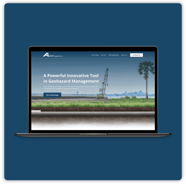
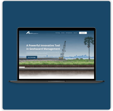
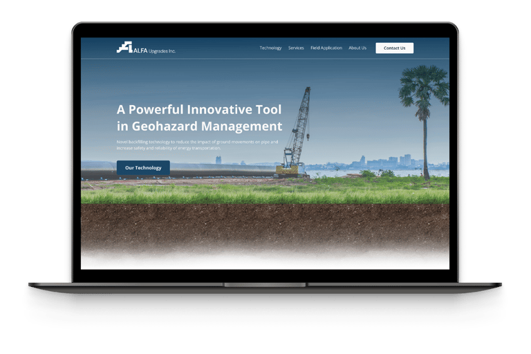
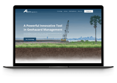
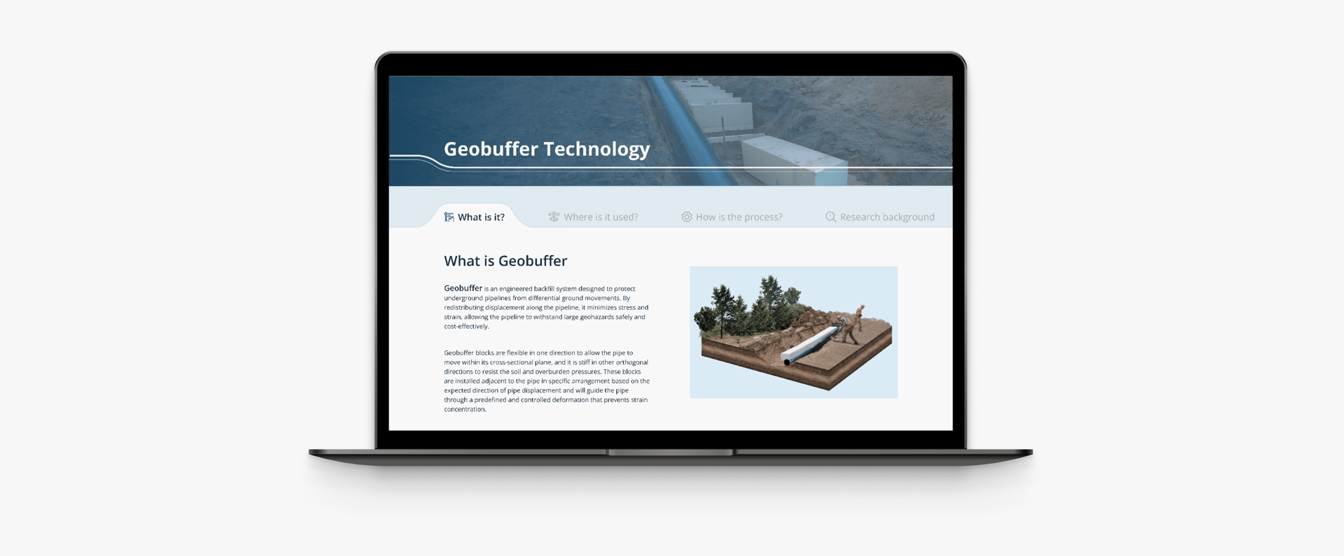
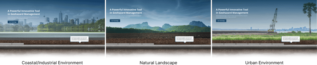
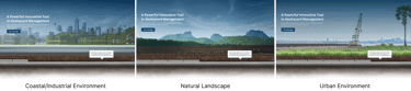
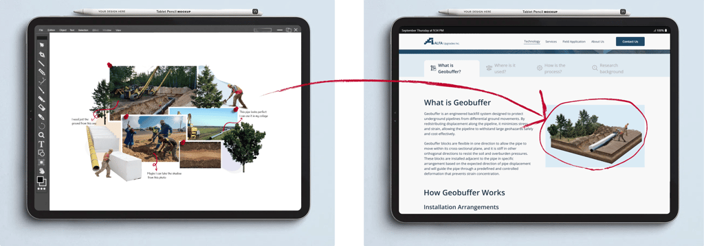
Hero Section Highlighting Technology and Versatility
To achieve this goal, we designed a dynamic hero section where the underground pipeline remains constant, while the surface changes to highlight various real world applications. Additionally, we introduced Geobuffer technology within the hero image, emphasizing its role in enhancing performance and reliability across diverse scenarios.
To complete the section, we included a concise supporting text next to the pipe to introduce the technology and establish credibility from the start.
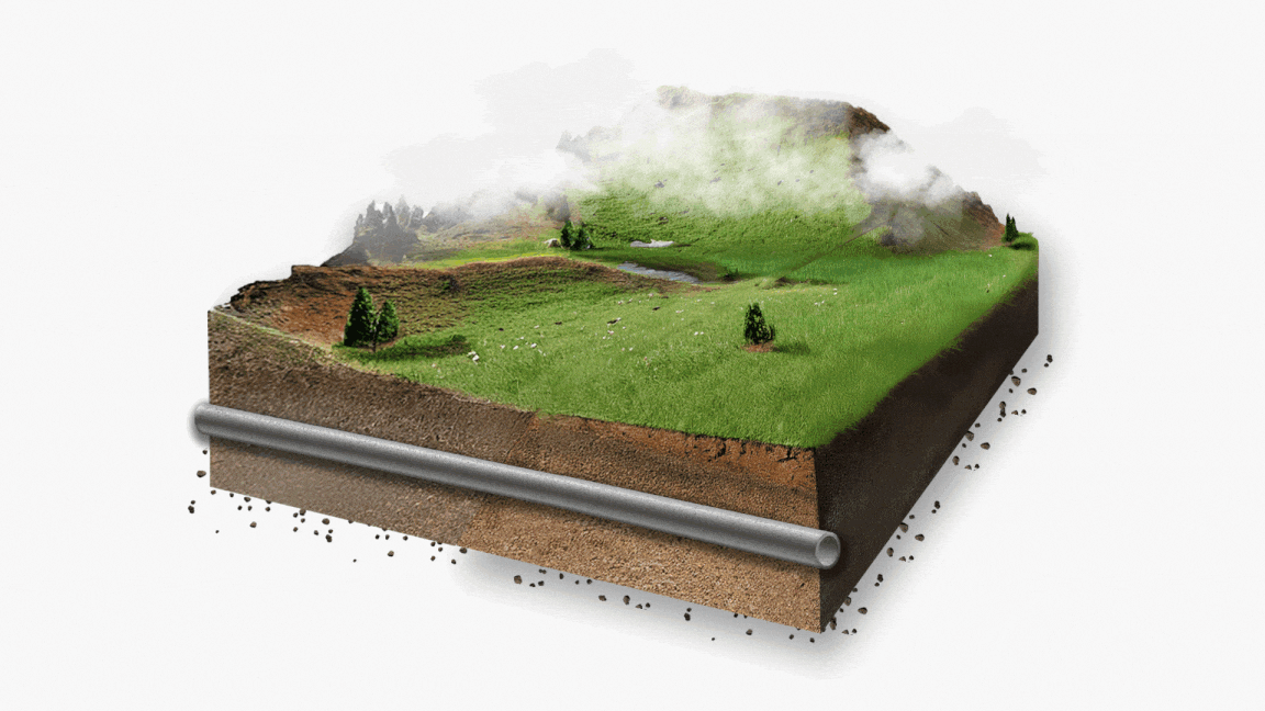
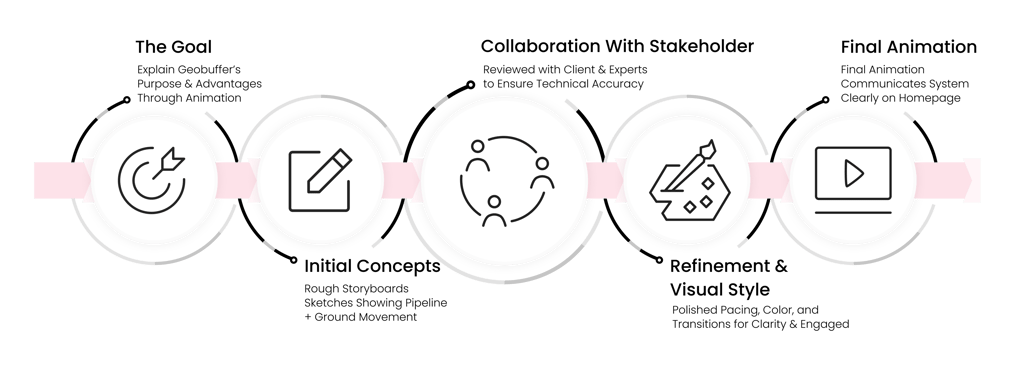
Bringing the Technology to Life with Animation
Our goal was to help users quickly understand how the technology works in a simple, engaging, and visually appealing way.
To make this possible created an animation that turned complex processes into an easy to follow visual story, highlighting the technology’s core functionality and versatility.
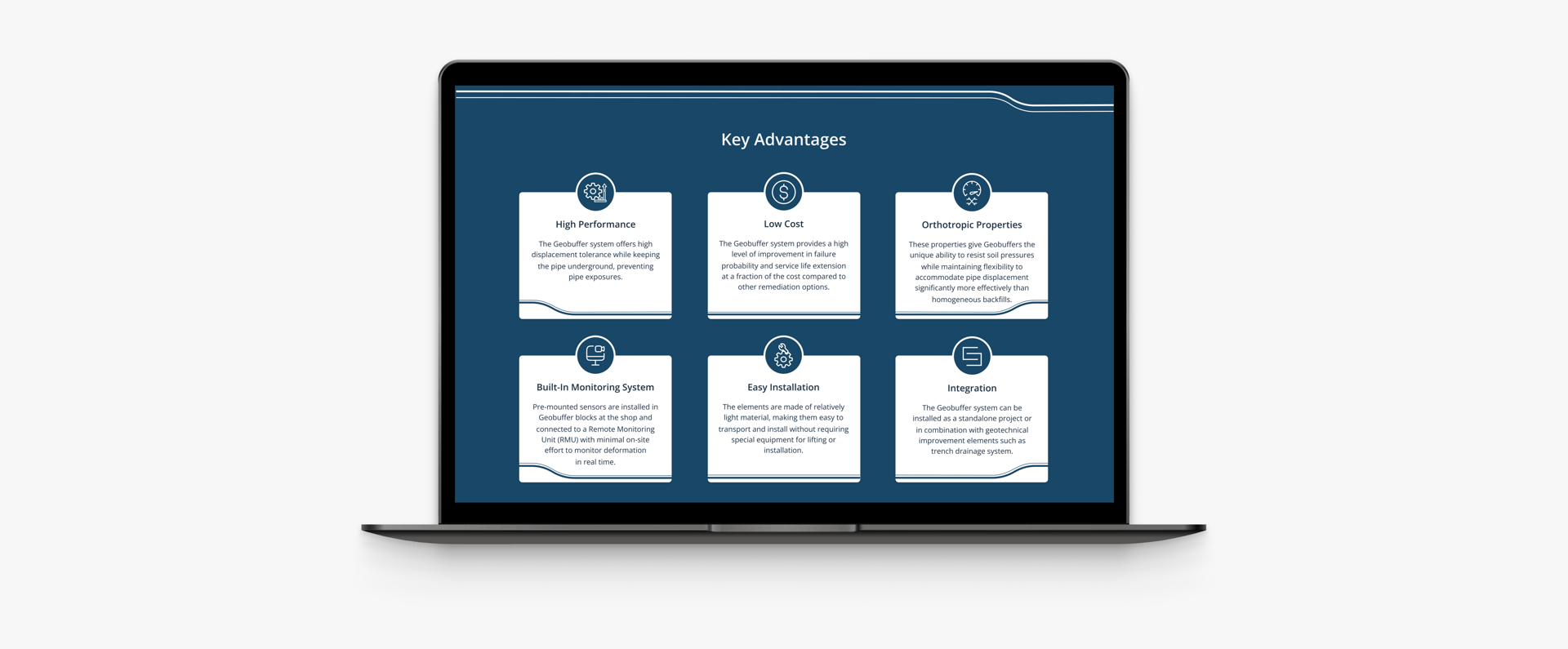
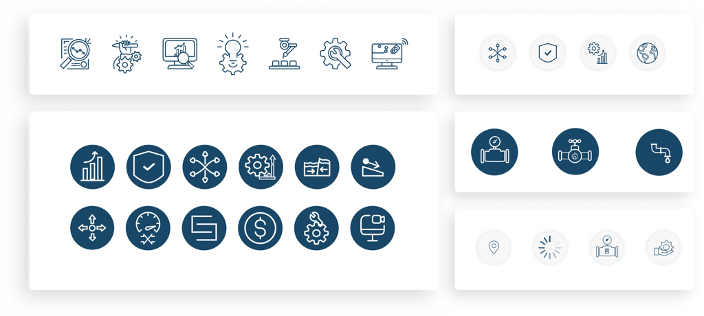
Custom Icons for Quick Visual Cues
To enhance comprehension and create visual rhythm across the site, we designed a full set of custom icons tailored to each section of the content. These icons served not just as decorative elements, but as functional cues to help users quickly interpret key ideas, especially in sections that were dense or technical.
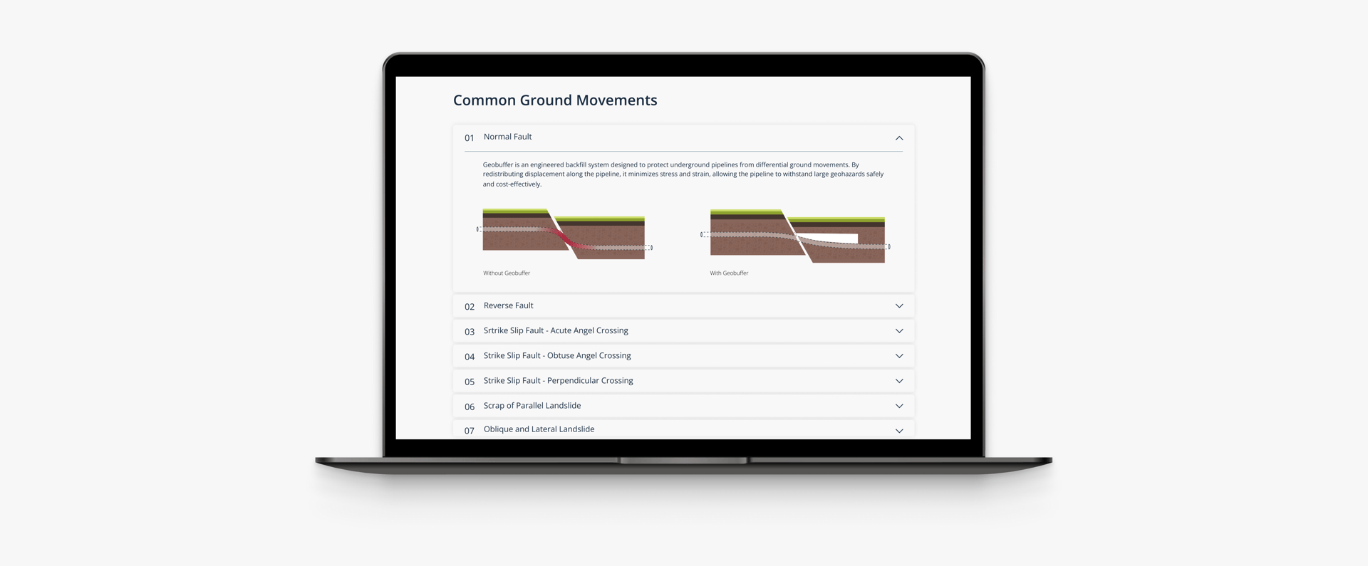
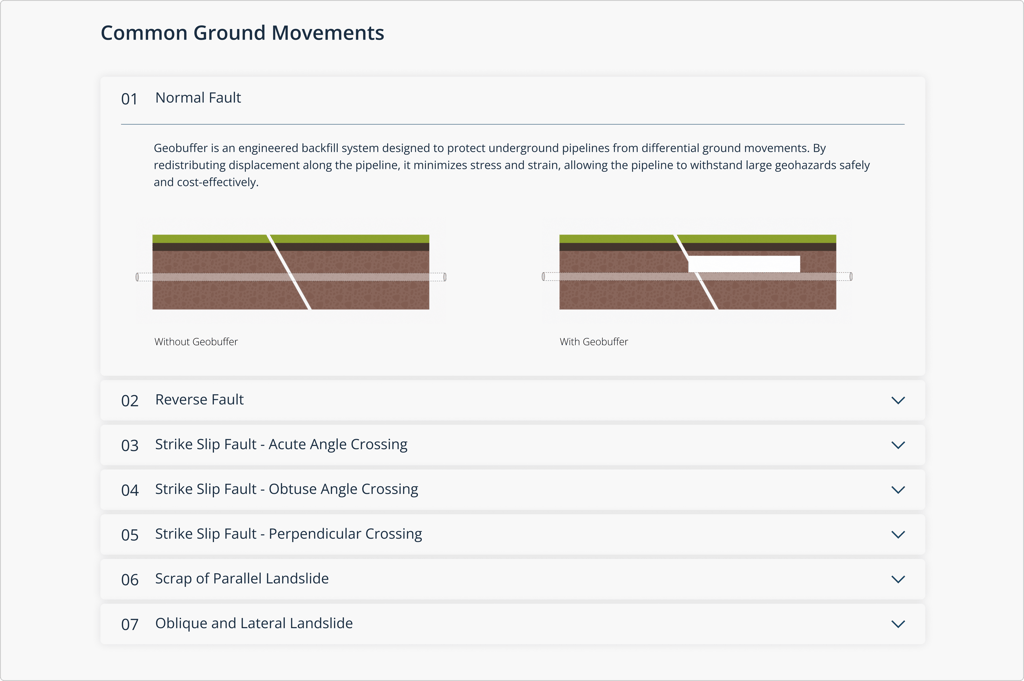
GIFs to Explain Technology
To clearly show how Geobuffer performs under different ground movements, we turned static AutoCAD drawings into animated GIFs. These visuals illustrated scenarios like lateral shifts and vertical displacement, helping users quickly grasp complex interactions without heavy technical text.

MICRO-JOURNEY TESTING
Instead of testing full user flows, we tested micro-decisions to uncover mental friction points:


“What does this animation tell you?”

“What do you expect happens next?”
“Does this icon make the topic clearer?”
Tested with engineers and context-aware users to ensure industry relevance.
Refined visuals based on where confusion or hesitation appeared.
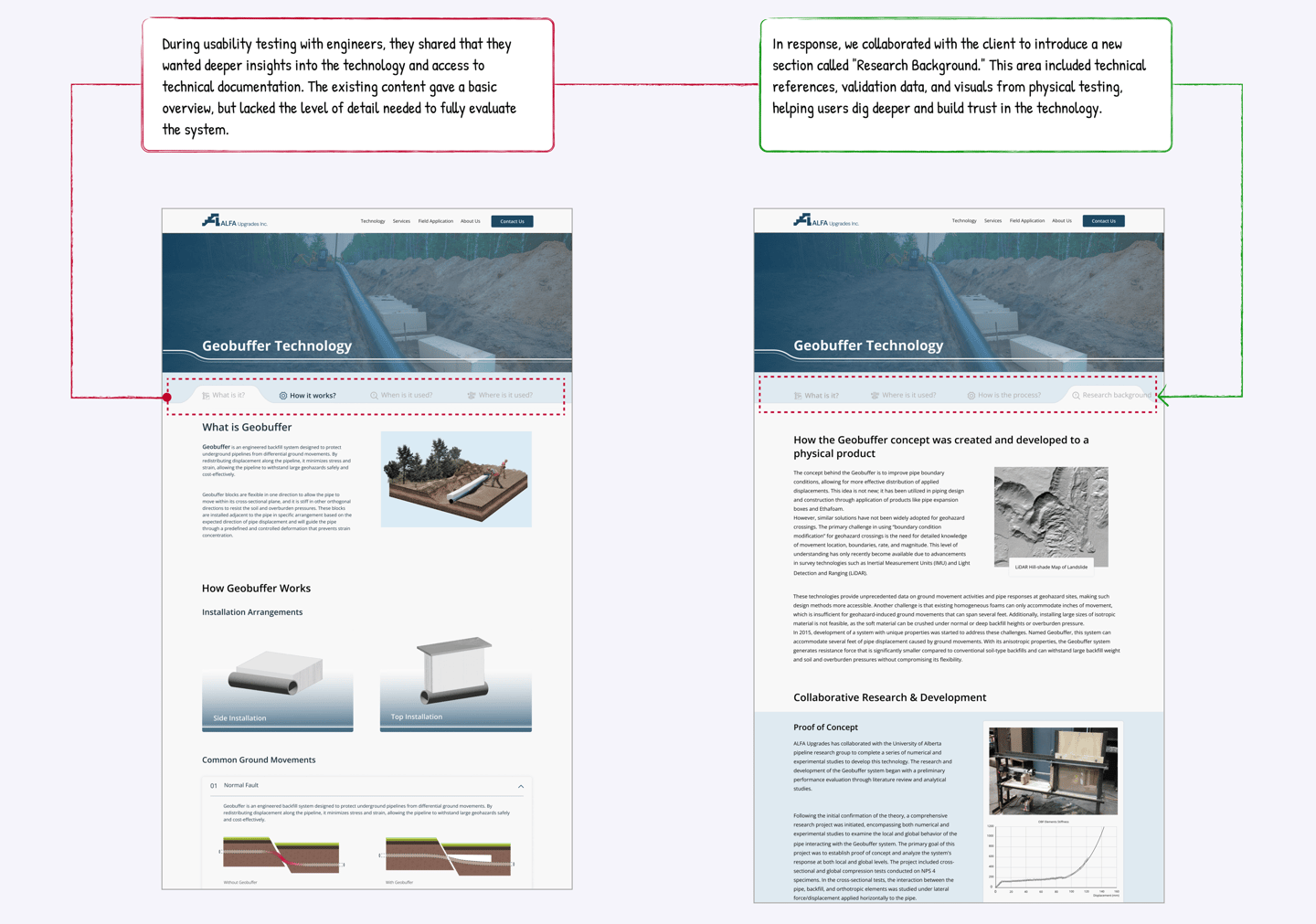
Stakeholder Validation
Ensuring Accuracy Through Iterative Review Each visual concept, from hero image to animations and icons, was reviewed with the stakeholder and refined based on engineering feedback. Multiple iterations were completed to ensure both clarity and technical accuracy, resulting in visuals that were not only engaging but also engineering-approved.

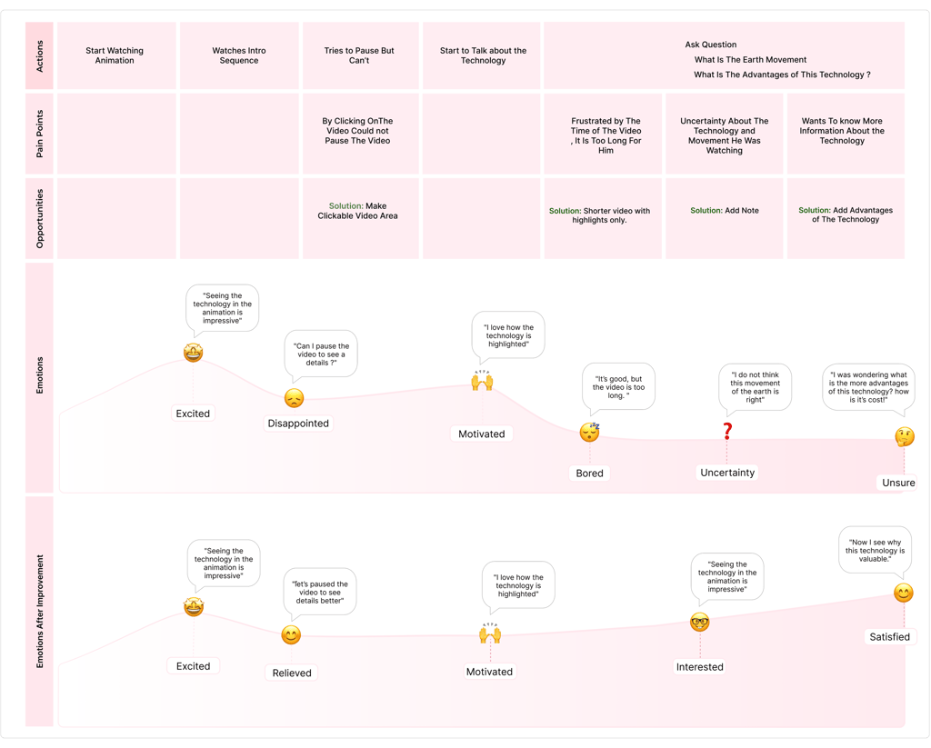
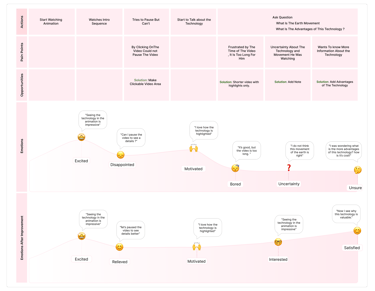
Emotional journey for understanding the technology In the animation
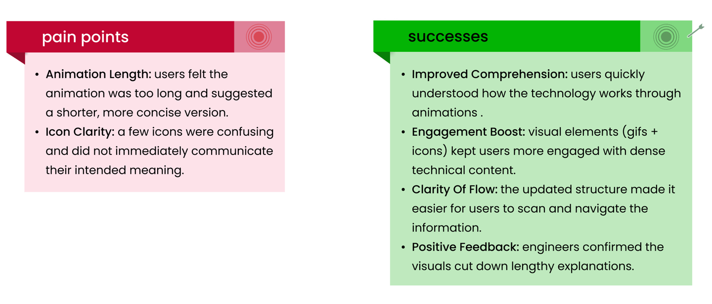
Pain Points
Animation length: Users felt the animation was too long and suggested a shorter, more concise version.
Icon clarity: A few icons were confusing and did not immediately communicate their intended meaning.
Successes
Improved comprehension: Users quickly understood how the technology works through animations .
Engagement boost: Visual elements (GIFs + icons) kept users more engaged with dense technical content.
Clarity of flow: The updated structure made it easier for users to scan and navigate the information.
Positive feedback: Engineers confirmed the visuals cut down lengthy explanations.
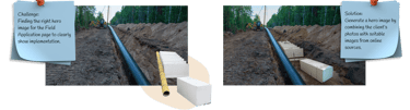
Problem #3 Visualizing a Technology with No Visual Assets
Transforming Low-Quality Photos into Professional, Trust-Building Visuals
Assessing the Photo Challenge
Received a large collection of product and project images from the stakeholder.
All images were low-quality, and unsuitable for a high-impact website.
Goal: Overcome the lack of professional photography while ensuring users could still trust and understand the product.
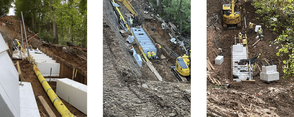
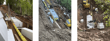
Photo Enhancement Process
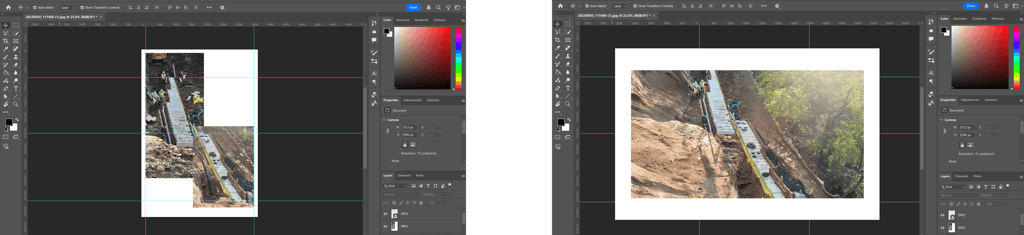
Selected the most usable images based on relevance and technical content.
Applied advanced Photoshop editing to remove visual noise, improve clarity, and adjust lighting and color balance.
Enhanced details to make the product recognizable and credible to potential clients.

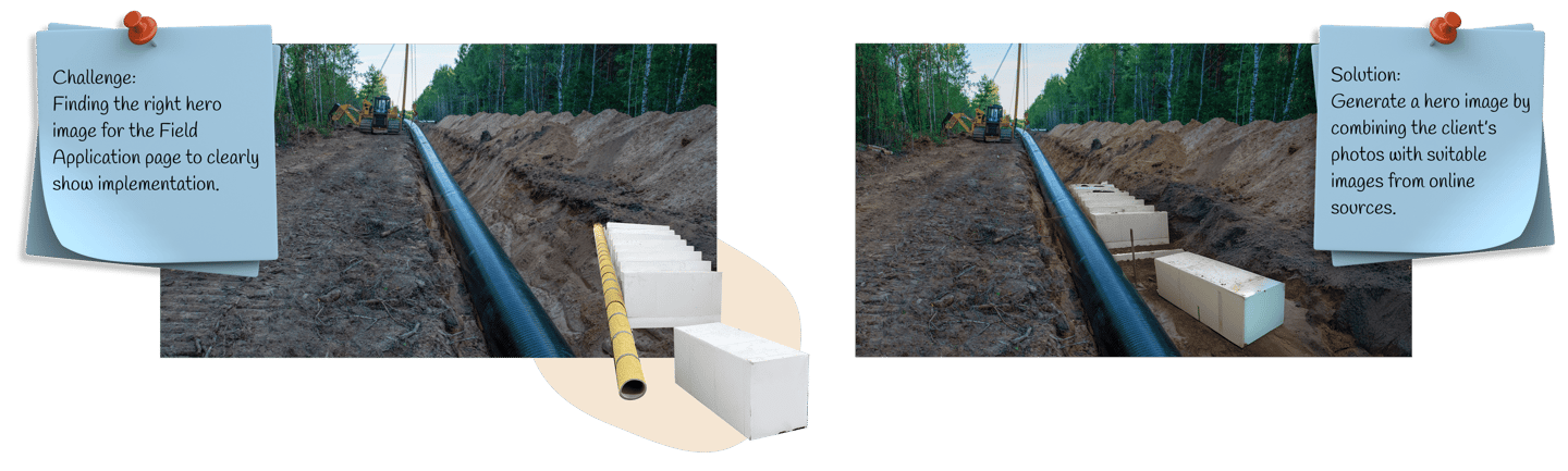

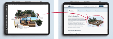
Challenge:
No image available to give the audience an immediate understanding of the technology and its implementation.
Solution:
Created a collage using client photos and design techniques to provide a clear, one-glance visualization of the technology
Design can express emotion as well as information.
Translating feedback into visual language taught me how colors, icons, and structure can communicate feelings as effectively as words.Iteration leads to clarity.
Each stage of redesign helped me understand how to simplify complexity making data visually appealing without losing accuracy or meaning.Empathy drives engagement.
Seeing how users emotionally responded to the visual changes reminded me that thoughtful design can build trust and motivation.Small details make a big impact.
From refining chart colors to mapping emotions, every design choice shaped how users interpret and connect with the experience.
What Did I Learn from Alfa Upgrades?