
NeighborTools
A peer-to-peer platform for collaborative tool lending and borrowing
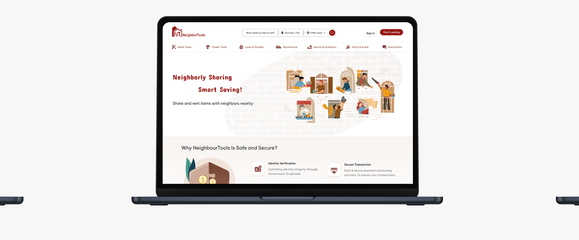
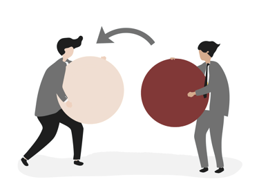
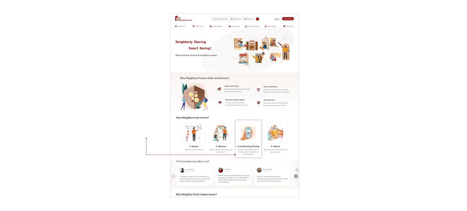
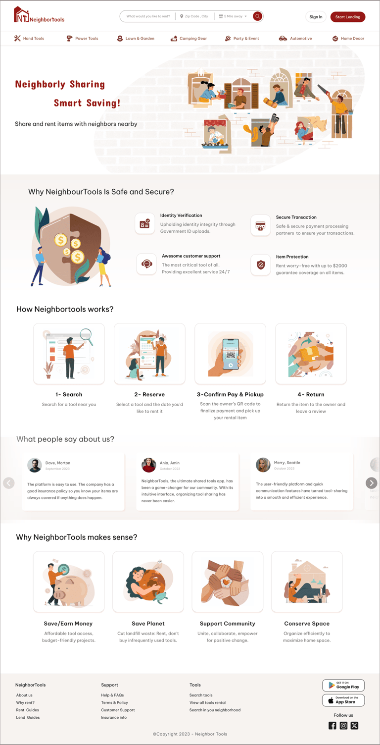
NeighborTools connects tool owners with renters in a safe, secure peer-to-peer sharing platform. Owners make money from unused tools, while renters save by avoiding purchases and supporting local communities.
Our vision is to create a user-friendly and secure platform that empowers communities to share tools efficiently and cost-effectively. By connecting tool owners with renters, we aim to foster sustainable practices, reduce waste, and strengthen local networks.
Project Overview
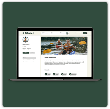
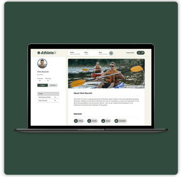
FINAL DESIGN
Problem Statement
People struggled to find affordable tools for occasional use, and the lack of storage space made owning these tools even more impractical. Renting from traditional stores was too expensive, and borrowing from friends or family was not always an option, leading to frustration and inefficiency.
Our Solution
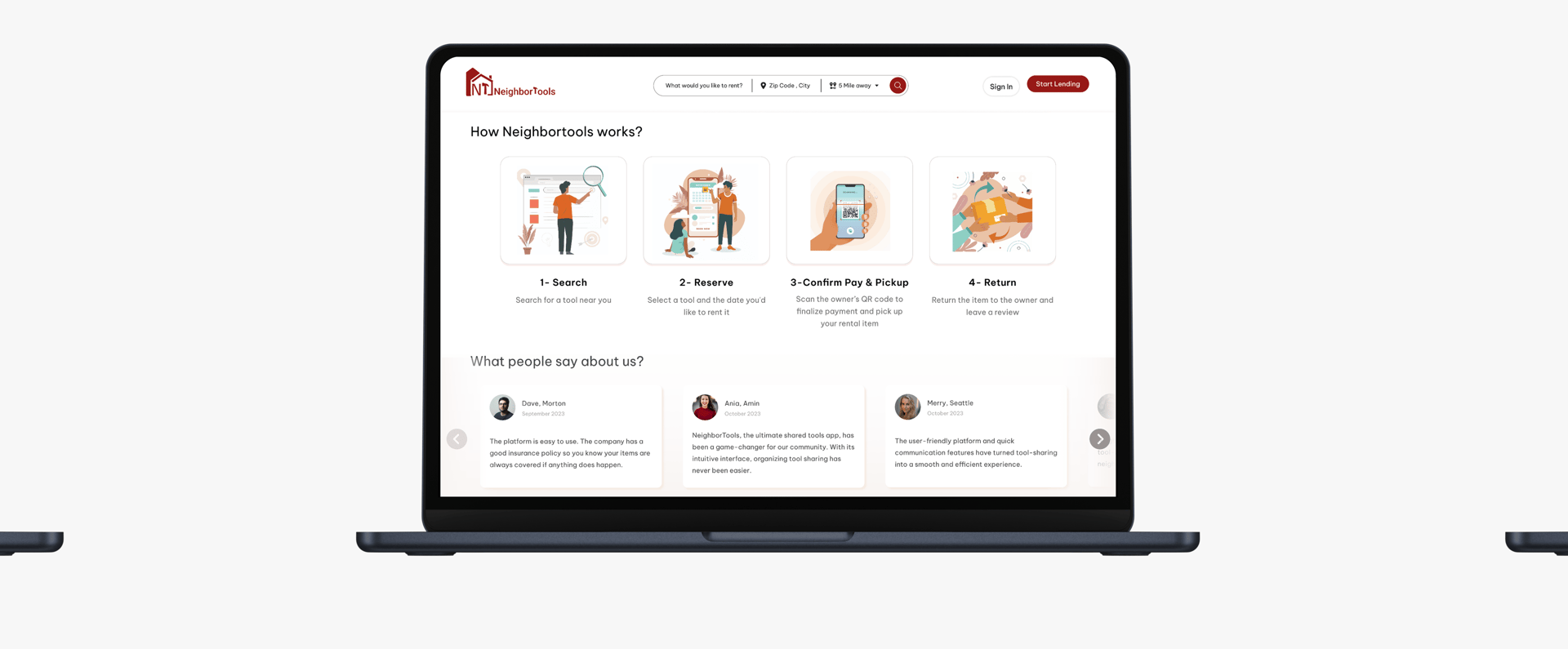
We developed a user-friendly website that connects neighbors for seamless tool sharing. Our platform ensures transparent pricing, easy booking, and reliable tool condition descriptions, eliminating the hassle of traditional rental stores. Users can conveniently browse nearby tools, check availability in real-time, and enjoy the affordability and accessibility of shared resources within their community.
Target Users
People looking for nearby tools to borrow and save money
Individuals who want to lend their tools, earn money and support the community
DISCOVER
Starting with understanding user pain points in a tool-sharing app
In the first step, we had to educate ourselves to better understand who we are designing for and how users are currently renting/lending their tools, so we conducted an initial interview with 8 individuals. To find the interviewees we posted in our neighborhood Facebook group and asked if people were interested in doing the interview. We aimed to identify their pain points and crucial factors involved in these processes by inquiring about their past experiences and preferred locations for borrowing tools.
From the interview, we found people like the idea of renting tools to earn money and help the environment but at the same time they have concerns about potential loss and fraud activity.
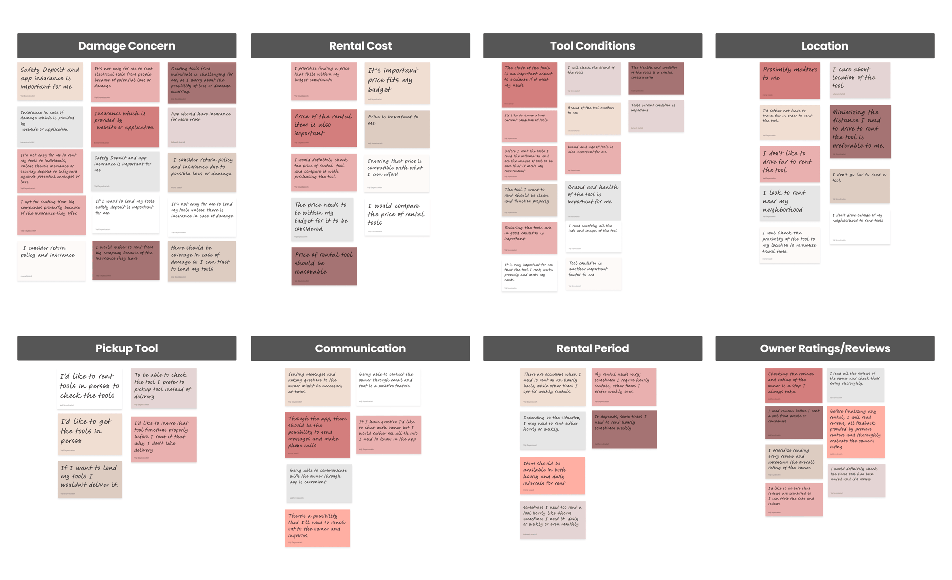
Concern about tools damage
Knowing about last condition or health of tools
Finding tools close to their location
Finding tools that fits their budget
To sort out the info, we used AFFINITY MAPPING, grouping user thoughts into clear trends.
Here's what we found is essential for our users:
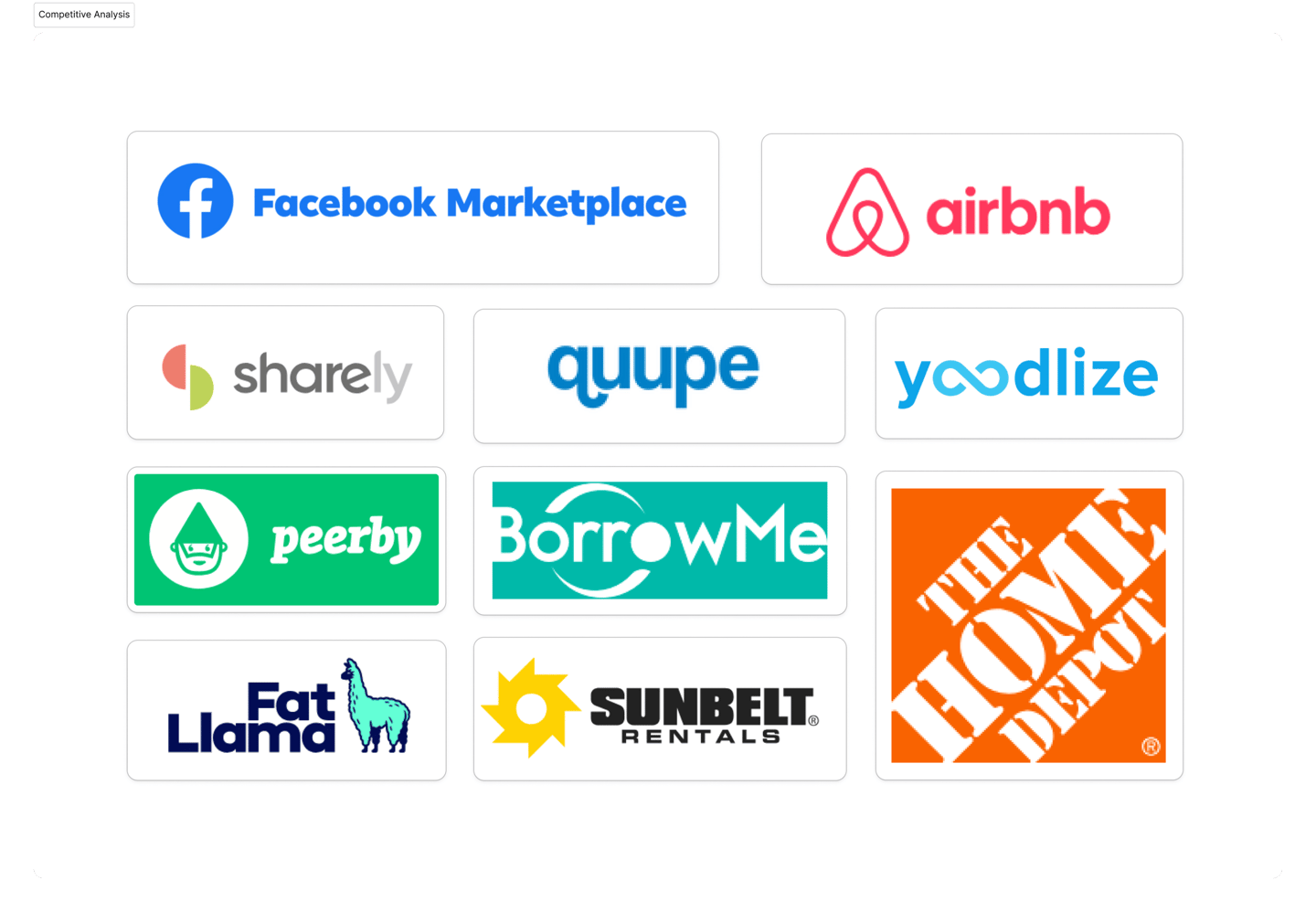
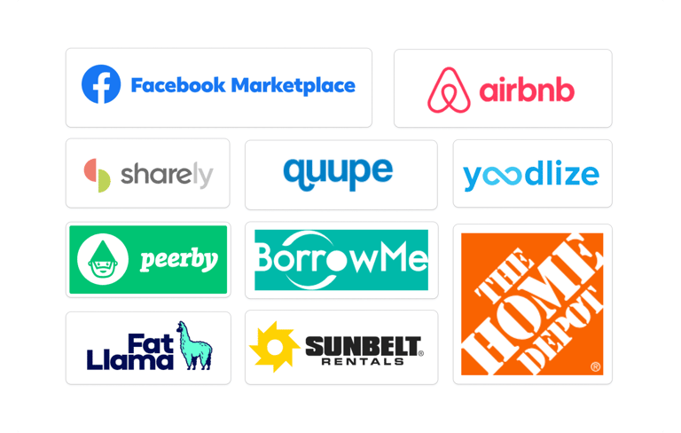
What do our direct and indirect competitors do!
We looked at Facebook Marketplace, as a good customer to customer app and Airbnb, as a successful app for sharing personal properties, and eight other similar websites. By studying them, we learned valuable lessons to improve the user experience of our product. We used them to make our information architecture and user flow.
We identified key features unique to Neighbortools, such as distance-based search, price suggestions in listings, displaying earnings in user profiles, and tool confirmation prior to payment deduction. These features set us apart from competitors who typically lack such offerings.
We streamlined the presentation of these features to ensure a seamless borrowing experience for users.
Here's what we found:
Top Takeaway of Research
01
Users prefer to rent the tools near by.
02
03
04
05
Users are concerned about the current condition of tools.
Transparent pricing and convenient payment are essential.
Seeing tool availability in real-time is crucial for users.
Users have concern regarding potential damage or loss.
DEFINE
Who We Are Designing For?
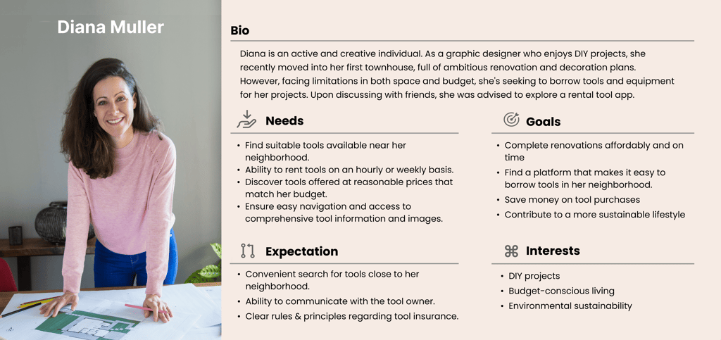
After conducting interviews, we identified a user personas for borrowing from NeighborTools: Diana Muller, who recently moved into her first townhouse and prioritizes space-saving and budgeting. We also developed a user flow for borrowing.
DEVELOP
Key Challenges and Potential Solutions
After diving deep into all our research data and understanding users' needs and problems, we endeavored to figure out how we could respond to their concerns and address them by incorporating a solution into our design. Here are the possible solutions we came up with:
Challenge 1:
Uncertainty regarding Insurance and tool protection against potential damage or loss for both owner and lender.
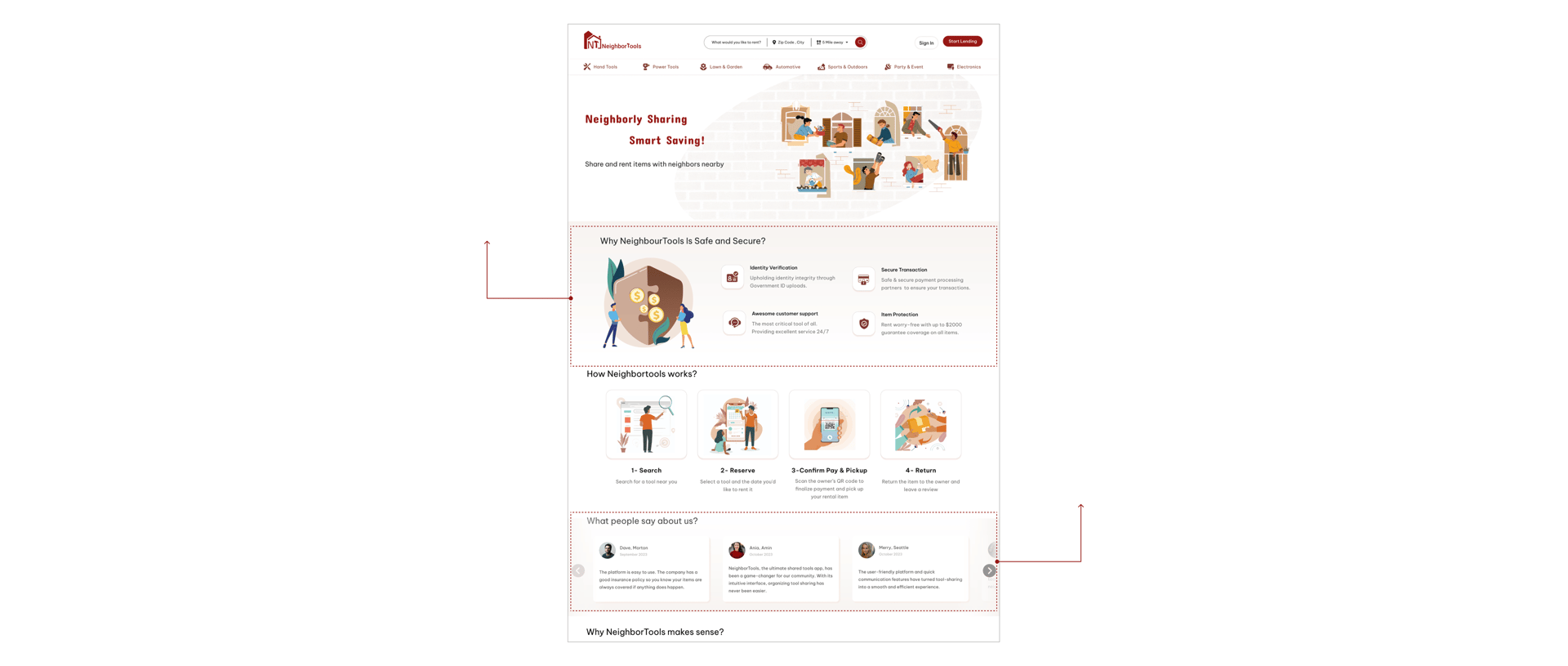
Dedicate a section on the first page of our platform (in both borrowing and lending mode) to highlight all the information regarding insurance and item protection.
Implement a section on the first page of our platform showcasing user reviews and feedback about their rental experiences with our platform.
02.Solution
01.Solution
Implement a section on the first page of our platform showcasing user reviews and feedback about their rental experiences with our platform.
01
Dedicate a section on the first page of our platform (in both borrowing and lending mode) to highlight all the information regarding insurance and item protection.
02
Challenge 2:
Concerns about the condition and functionality of tools, especially power tools, ensure they match the provided pictures.
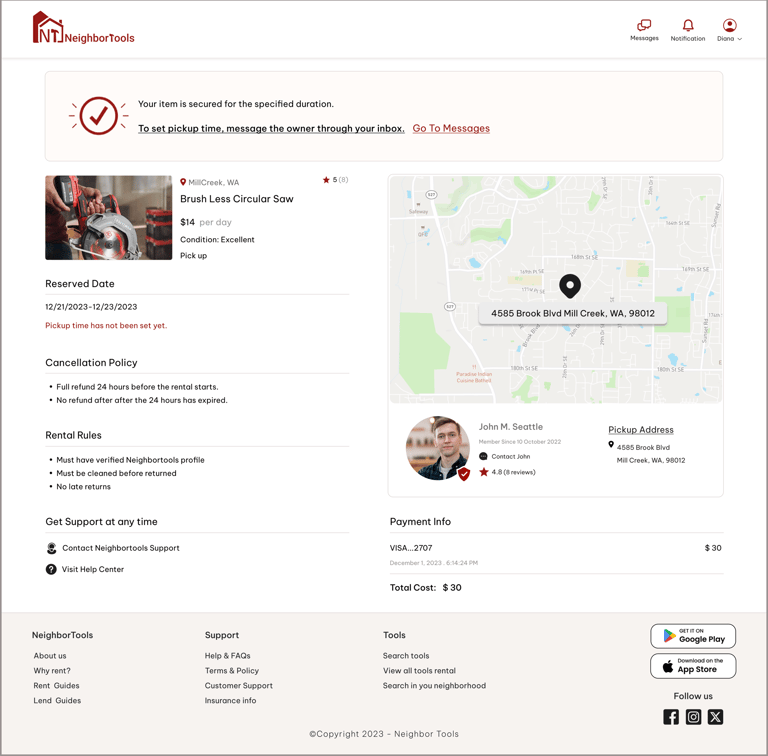
We also emphasize the confirmation system on the first page. Renters aren't charged until they receive and confirm the tool.
01.Solution
We also emphasize the confirmation system on the first page. Renters aren't charged until they receive and confirm the tool.
01
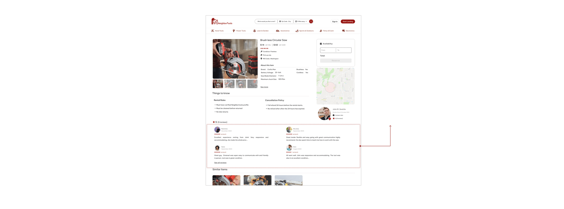
We've introduced a rating and review system, enabling users to leave feedback after each rental. This fosters trust within the community and provides valuable insights for owners and renters alike.
02.Solution
02
We've introduced a rating and review system, enabling users to leave feedback after each rental. This fosters trust within the community and provides valuable insights for owners and renters alike.
Challenge 3:
Proximity is an important factor for renters. Most of the users don’t like to travel far when renting a tool.
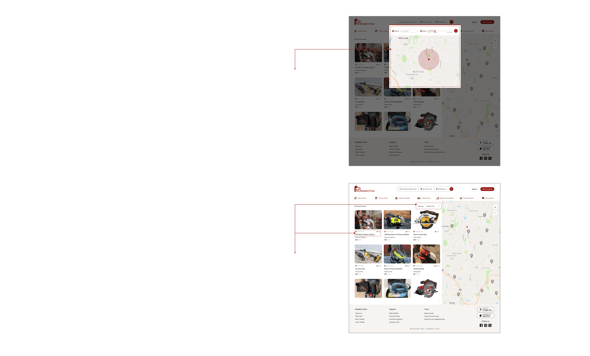
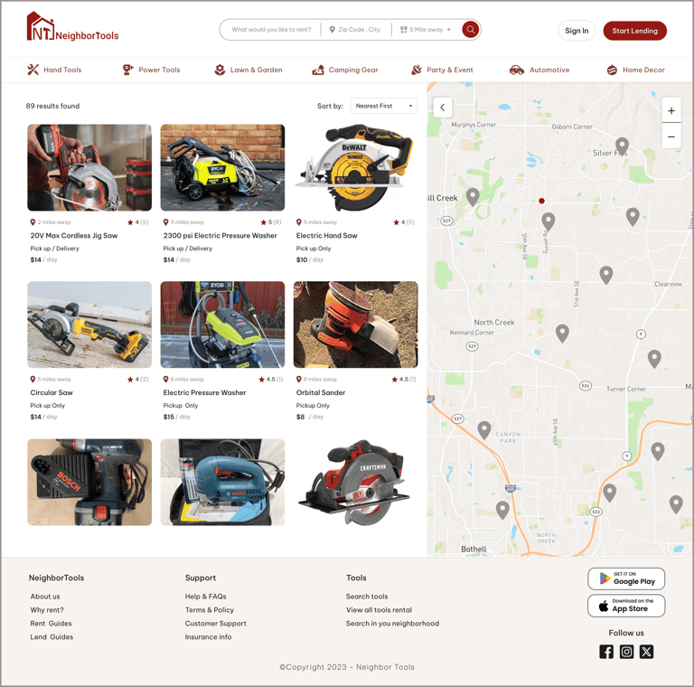
We implemented a "Search by Distance" feature, allowing renters to search within their city and specify the distance they are willing to travel in miles.
01.Solution
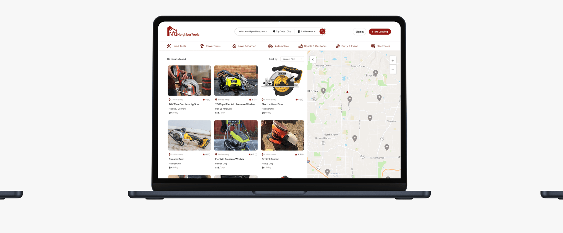
Sorting our search results to "Nearest First" by default and displaying the distance of each tool from the renter's current location.
02.Solution
01
Sorting our search results to "Nearest First" by default and displaying the distance of each tool from the renter's current location.
We implemented a "Search by Distance" feature, allowing renters to search within their city and specify the distance they are willing to travel in miles.
02
Iterate
Iterative Design Process:
We iteratively created and tested wireframes and interactive prototypes to refine our design. By conducting multiple rounds of user testing, we ensured that our final product met the needs of our user persona.
Usability Testing (Round 1)
Here is the iterative design process for "Home Page" and "Tool's Description page"
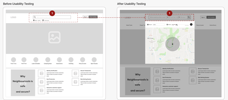
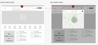
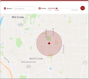
We noticed users struggle with understanding distances like "5 miles." So, we improved our platform with a map feature. Now, instead of typing a number, users can visually set the search radius on a map.
01
"Home Page"
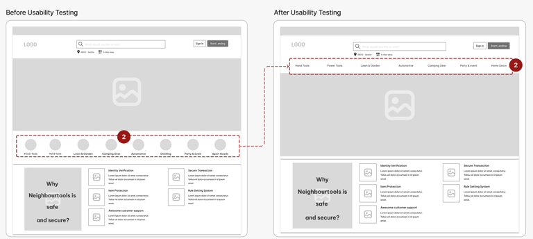
In our first design, users had trouble finding rental categories. So, we made a change and put the categories right into the main section. Now, users can see all the rental options at a glance.
02
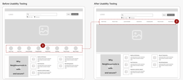
At first, we used an accordion menu to save space and organize content. However, it didn't work well on different screen sizes and made user interaction slower. So, we redesigned it: now, each section has its own space on the page.
We noticed that our users had difficulty in reading long text to find tool information. As a result, we improved the way we present information and adjusted the input form for listing tools accordingly.
01
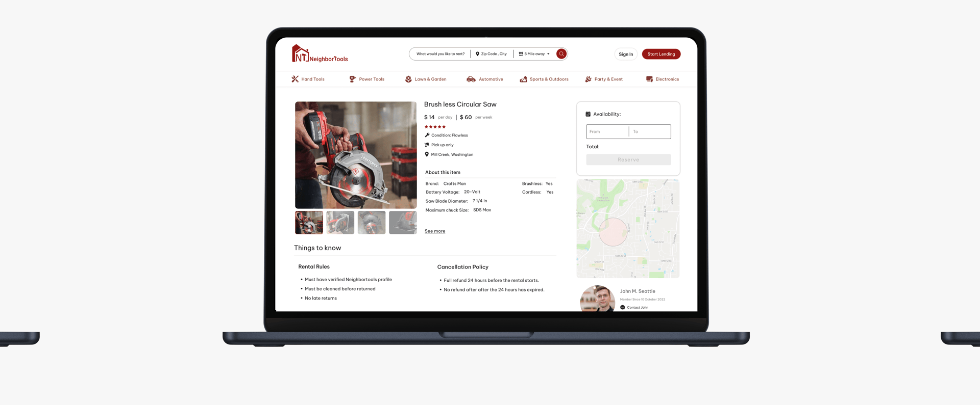
To make things more welcoming and user-friendly, we switched from "Rules and Policies" to "Things to Know." This change suggests that the information provided is helpful and informative rather than strict or regulatory.
02
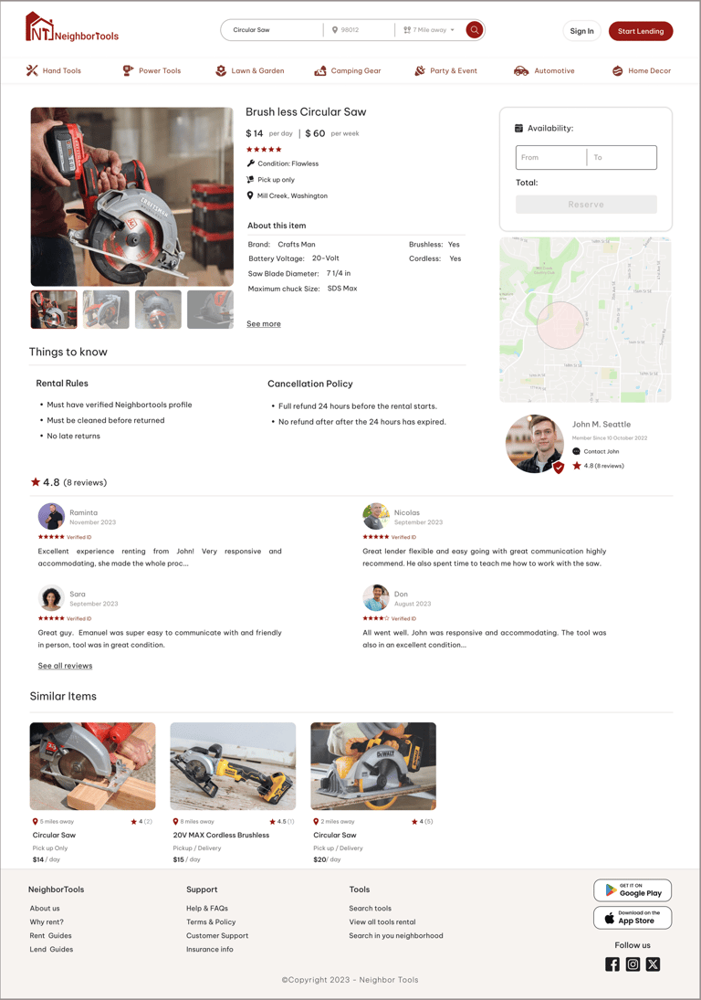
We upgraded the "review" section to a more detailed design because users needed to find and read reviews easily and quickly.
03
"Tool's Description page"
Moodboard
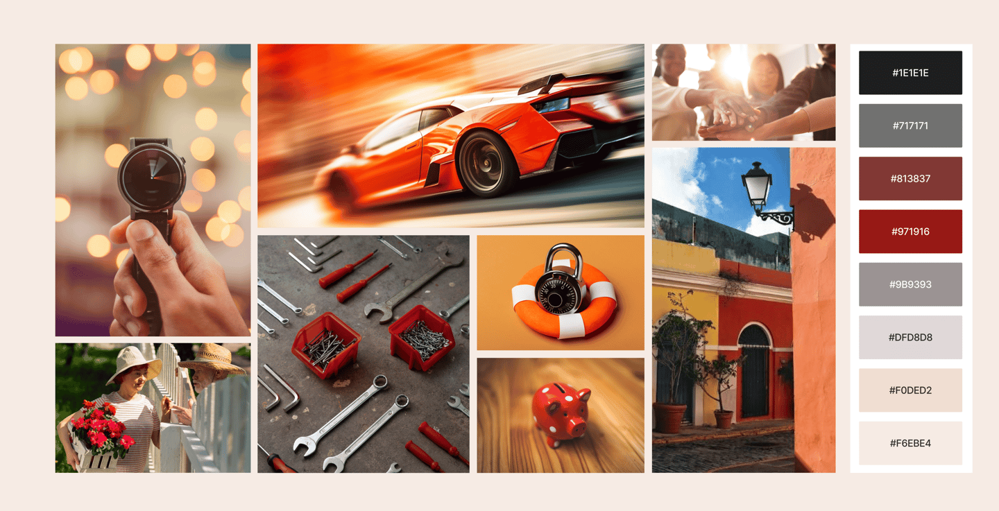
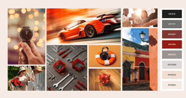
To design a high-fidelity interface for NeighbourTools, we start by creating a mood board that reflects the main goals and desired feelings as outlined by stakeholders. This helps us establish the visual direction and overall aesthetic for the interface.
Creating Consistency

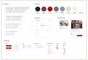
We developed a visual style guide to maintain consistency throughout the product. It outlines correct use of typography, colors, and UI elements, helping other designers apply them accurately when recreating or expanding the app.
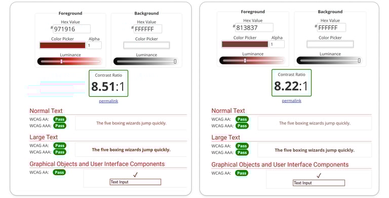
Ensuring Color Accessibility For All Users
The contrast between the foreground and background colors of the primary and secondary buttons was tested on color blindness websites to ensure acceptability.
Usability Testing (Round 2)
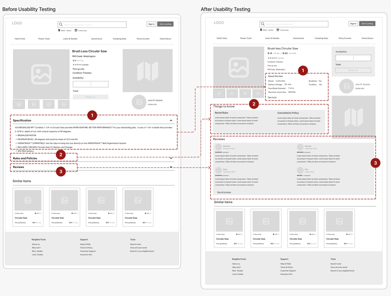
Here is the iterative design process for "Search Result Page" and "Item Detail Page"
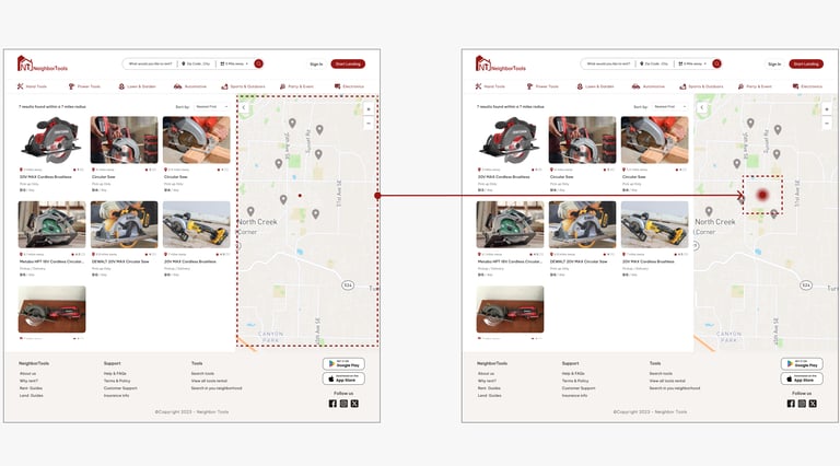
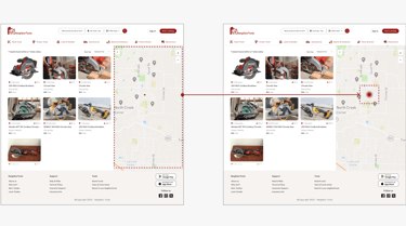
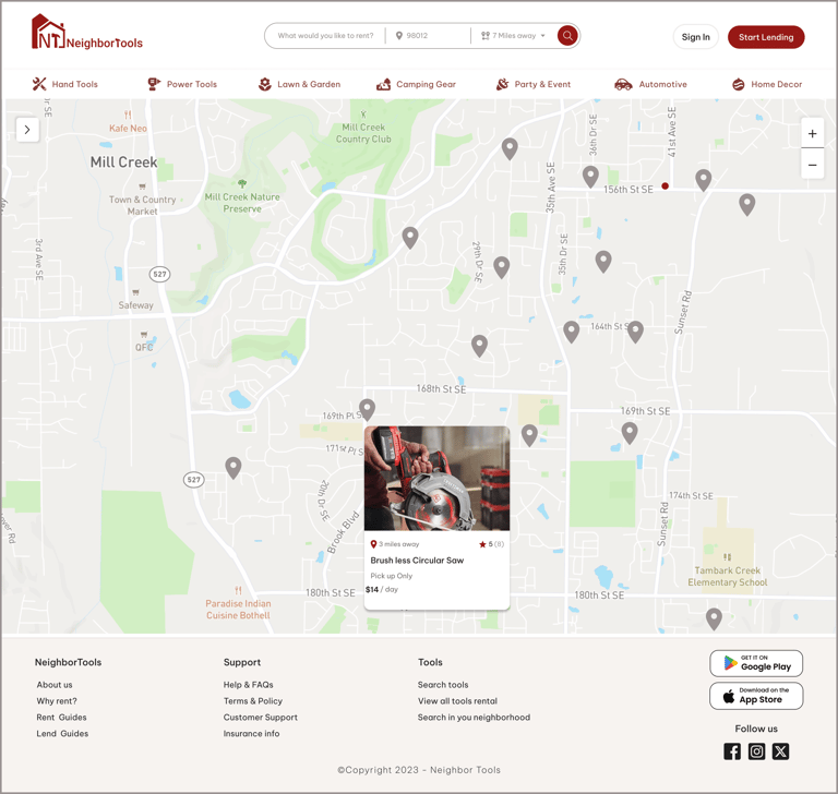
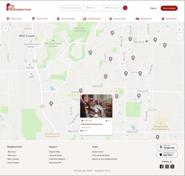
"Search Result Page"
We noticed that many users struggle to locate themselves on the map. To address this, we display the user's location as a blinking spot, making it easier for users to find themselves and understand distances on the map.
Before Usability Testing
After Usability Testing
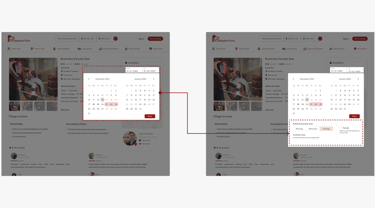
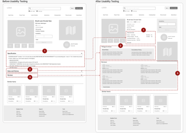
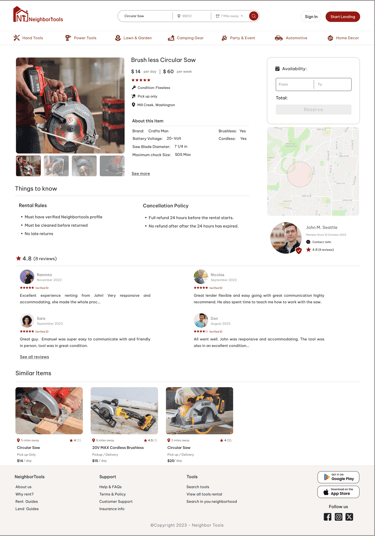
"Tool's Information page"
On the Item detail page, users requested more precise timing options for setting borrowing duration and pickup dates beyond whole days. We addressed this by introducing preferred pickup times in three slots: Morning, Afternoon, and Evening, along with a Flexible option. Lenders must initially select these time slots to make them available for users to choose from.
Before Usability Testing
After Usability Testing
DELIVER
Delivered Design Pages


Home Page
Power Tools
Item Detail
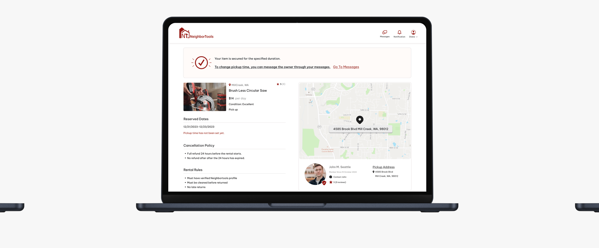
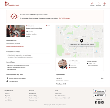
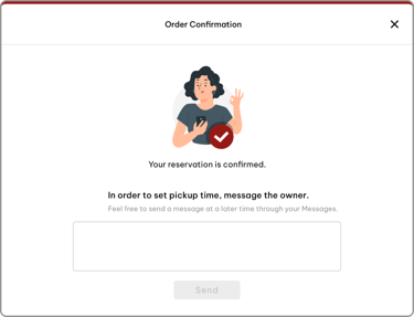
Reservation Confirmation
zip Code
Extended Map
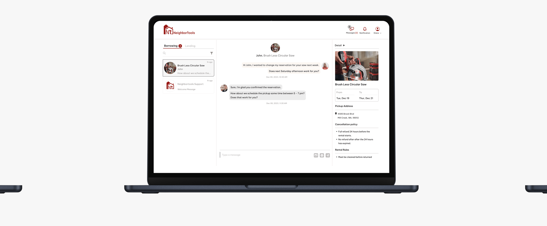
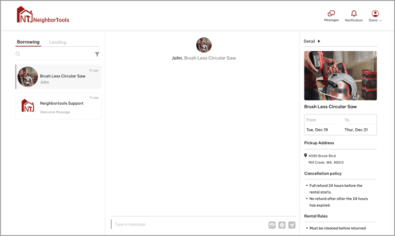
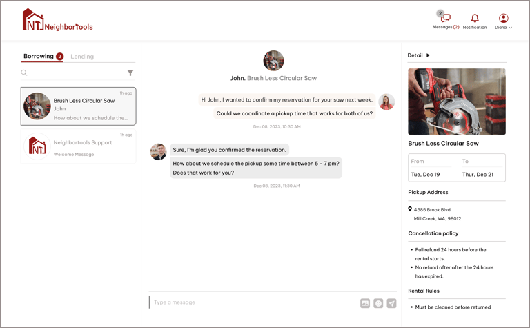
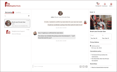
Inbox
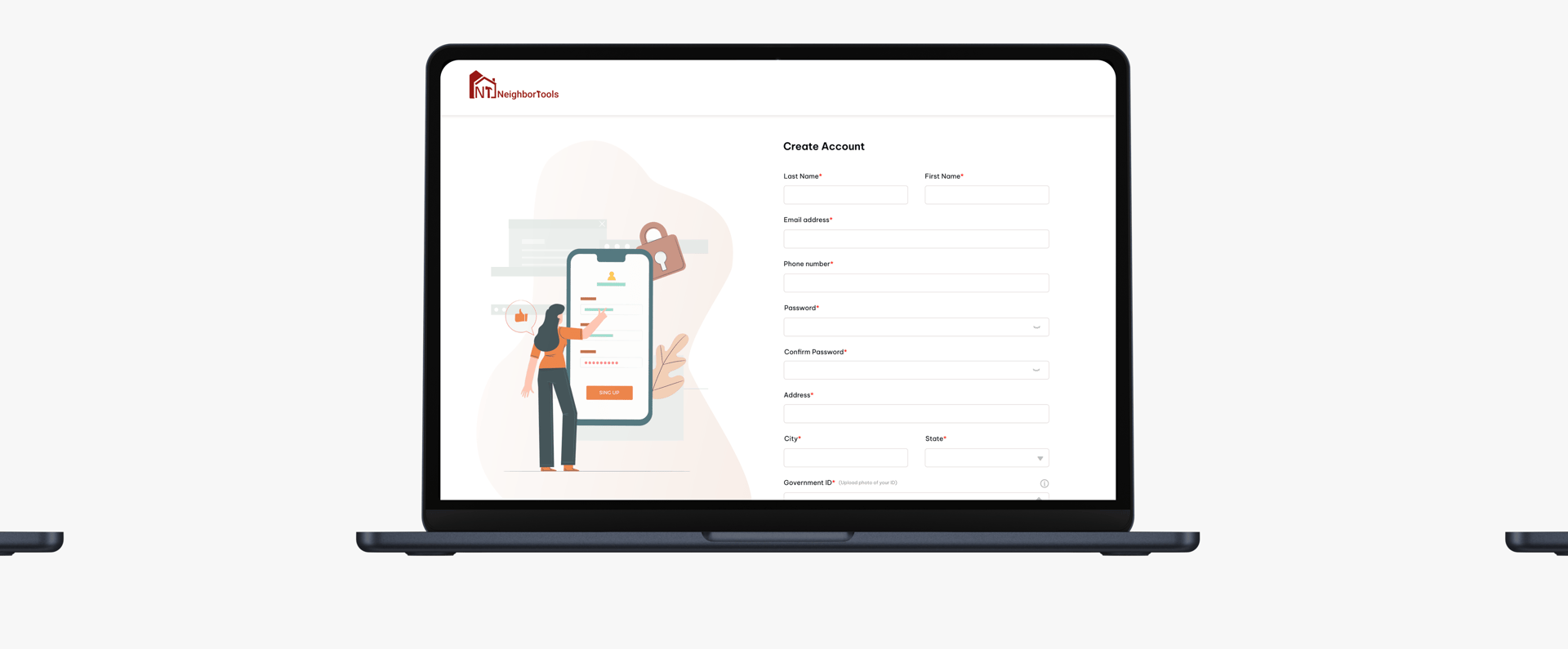
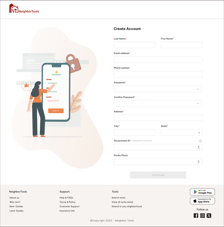
Creat Account
Final confirmation
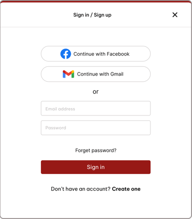
Sign in/up

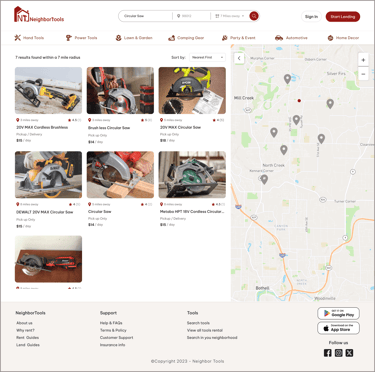
Search Result

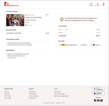
Confirm & pay
Final Prototype

Learnings and reflections
This project taught me that designing for community means designing for trust. Every decision, from how a tool’s condition is shown to how easily someone can find the nearest item, shapes whether users feel confident enough to engage.
I learned to let go of early assumptions and listen closely to user feedback, even when it meant rethinking core flows. Iterating quickly kept the design grounded in real needs, and reminded me that the best solutions often come after you’ve been willing to change direction.