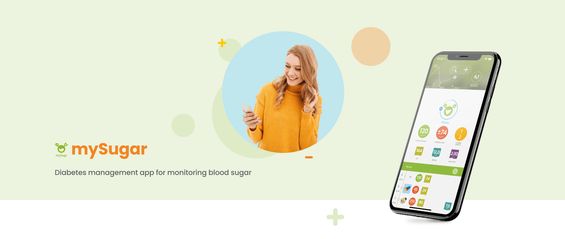

The mySugr app is a diabetes management app designed to help people living with diabetes track and manage their daily health data. It simplifies diabetes management by integrating key features that help users monitor their blood sugar levels, insulin intake, and lifestyle habits.
What is "mySugar app"?
My Role
I was tasked with redesigning the client's website to boost user engagement and functionality. After evaluating the existing site, I identified issues with the booking system, navigation, and lack of customer reviews. I took charge of the entire design process, implementing a user-friendly booking system, improving site navigation, and adding customer reviews. The redesign resulted in increased online bookings and enhanced customer satisfaction, effectively meeting the client's goals.
Timeline
2 Weeks
Team
Group of 2
Role
UX/UI Designer
Tools
Figma, Photoshop,

The mySugr app is a diabetes management app designed to help people living with diabetes track and manage their daily health data. It simplifies diabetes management by integrating key features that help users monitor their blood sugar levels, insulin intake, and lifestyle habits.
Project Overview
FINAL DESIGN



Problem statement
Users of the MySugr app have expressed dissatisfaction with the report page due to its lack of customization options and user-friendly design. Specifically, users are unable to generate reports with an visual overview of their data for customized durations and specific content tailored to their needs. Additionally, the current design of the report page is perceived as unintuitive, making it difficult for users to navigate and extract meaningful insights.
The Solution
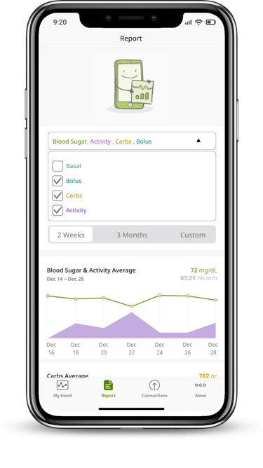
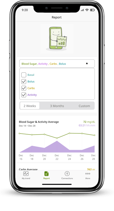
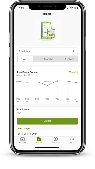
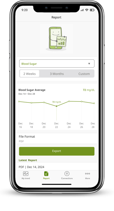
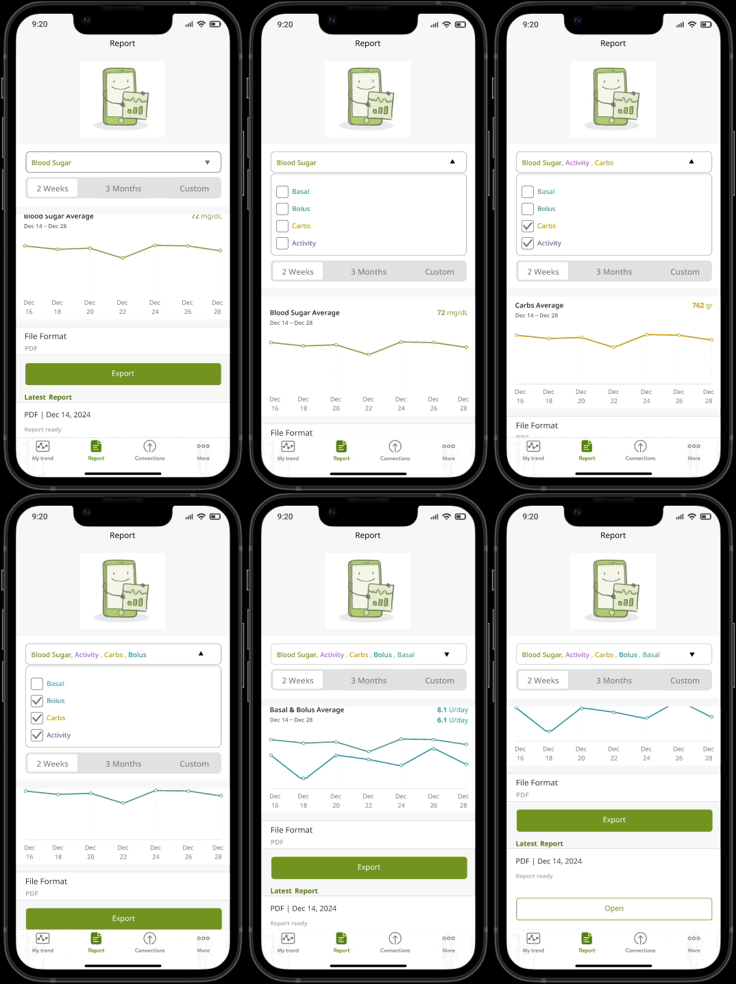
to address the issues identified with the MySugr app’s report page, we simplified the design to enhance usability and provide users with greater flexibility and control. The updated report page includes the following improvements:
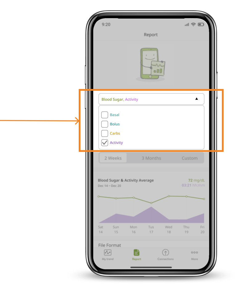
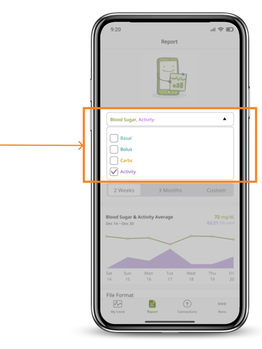
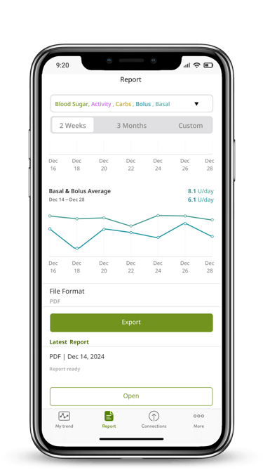
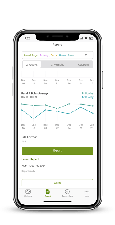
Customizable Parameters: Users can now add additional parameters (e.g., Basal, Bolus, Carbs, Activity) to their blood sugar overview, tailoring the report to their specific needs.
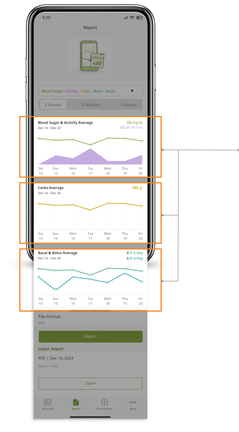
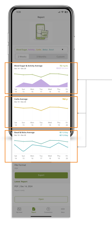
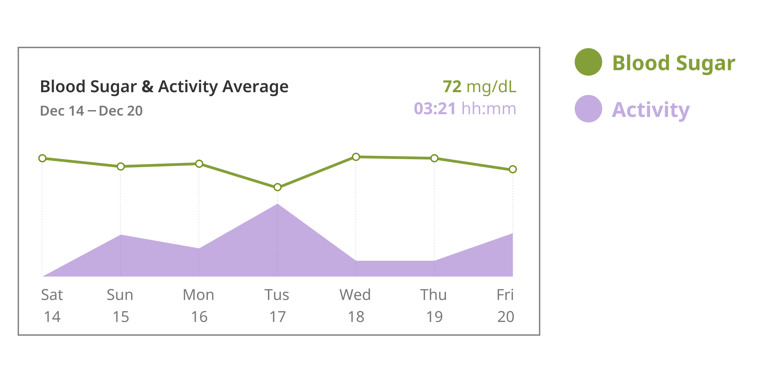
Interactive Visual Graphs: Before extracting a report, users can view an intuitive, consolidated graph that presents an overview of all selected parameters in a single visual, making it easier to interpret trends and patterns.
Streamlined Design: The layout of the report page has been simplified to ensure an intuitive, user-friendly experience, reducing the cognitive load and making navigation more seamless.
These enhancements aim to provide users with actionable insights, empowering them to manage their diabetes more effectively while improving their overall experience with the mySugr app.
RESEARCH PROCESS
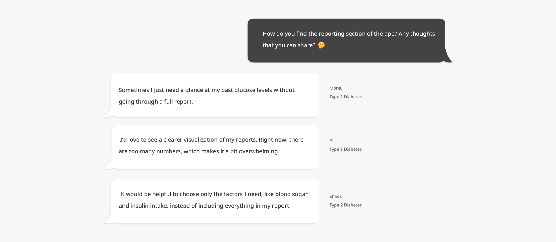
Interviews with 6 long-term MySugr users revealed a lack of customization in reports
During interviews conducted with 6 long-term users of the MySugr app (each having used the app for over one year), several pain points were identified regarding their experience. A significant majority of the feedback centered on issues with the report page, which emerged as a critical area for improvement.
1. Lack of a Visual Overview: Users reported the absence of an intuitive visual representation that consolidates their health data, making it difficult to interpret trends and insights at a glance.
2. Limited Customization Options: Users expressed frustration over not being able to select specific parameters (e.g., Basal, Bolus, Carbs, or Activity) to include in their reports, which limited the relevance of the information presented.
These issues highlight the need for a more user-centric approach to the report page, focusing on customization and visualization to better meet users’ needs and improve their overall experience with the app.
Key concerns raised by users included:

Lack of a Visual Overview:
Key concerns raised by users included:

Limited Customization Options:
Users reported the absence of an intuitive visual representation that consolidates their health data, making it difficult to interpret trends and insights at a glance.
Users expressed frustration over not being able to select specific parameters (e.g., Basal, Bolus, Carbs, or Activity) to include in their reports, which limited the relevance of the information presented.
Research Constraint
Finding people with diabetes who had used the app for over a year was challenging, so we relied on a small but committed group of users. While this meant fewer voices, their deep, long-term experience gave us valuable, focused feedback.
How We Recruited Participants:
online diabetes communities
support groups
relevant social media platforms

Persona
Challenges in implementation
One of the significant challenges was ensuring that users could see trends as graphs rather than raw numbers to better understand their glucose spikes. For example, understanding how physical activity impacts glucose levels requires a more visual approach.
Customization Options: We added options for users to select parameters (Basal, Bolus, Carbs, and Activity) for each reporting period. However, the main challenge was managing different metrics with varying units, such as glucose levels and Basal insulin units, which couldn’t fit into a single chart.
Solution: During usability testing, we decided to display different charts for each metric in a stacked format within the same timeframe. This approach allowed users to view all relevant data without compromising clarity.
Activity Integration: Physical activity, being a qualitative factor, was incorporated into the main glucose chart. This helped users correlate their activity levels with glucose trends visually.
