Saving Faces Skin
Website Redesign for a Local Spa Salon
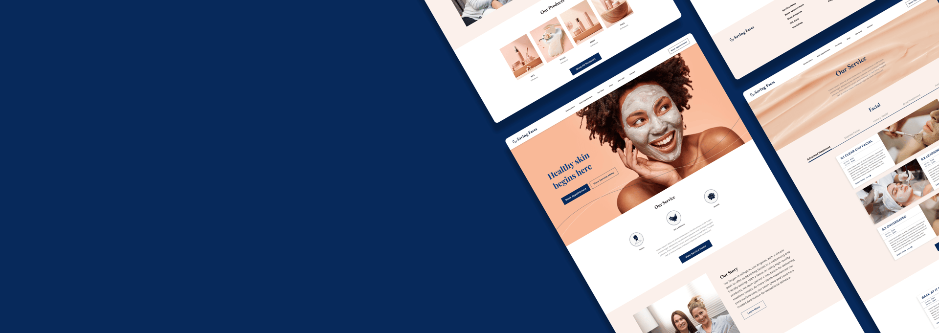
Saving Faces Skin is a skincare brand run by two friends, specializing in organic facial treatments, massages, and waxing services. In addition to their personalized skincare services, they offer a range of organic products for sale. The brand is dedicated to natural and holistic skincare solutions, aiming to provide clients with high-quality, organic treatments that cater to various skin needs and preferences.
Project Overview
FINAL DESIGN
DESIGN PROCESS
Problem statement
Business Goals
Increase Online Bookings: Implement a functional and user-friendly online booking system.
Enhance Customer Satisfaction: Implement a functional and user-friendly online booking system.
Categorize Services: Clearly organize services to make it easier for users to find and select options.
Boost Product Sales: Streamline the process for browsing and purchasing organic skincare products.
No one uses the website to call and book services
Users stop finding services in the middle of their search
Reviews are high but there is no space on the website to display them
Our Research Journey
Usability heuristic evaluation
Heuristic evaluation is the process in which a team analyzes a website from the point of view of usability, including navigation, clarity of information, consistency, and error prevention. Using these findings, we improved the browsing experience and made it more user-friendly.
1.Non-functional "BOOK" button
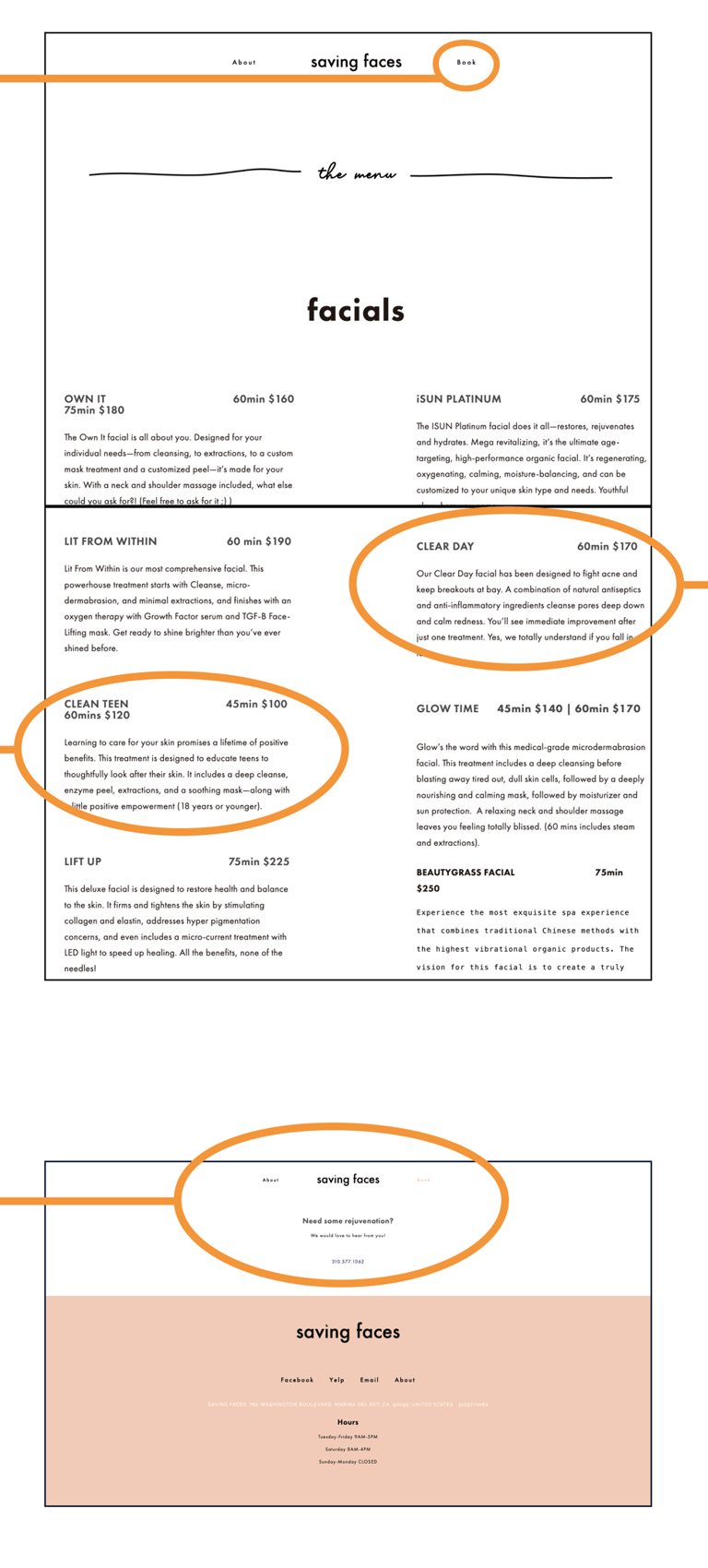
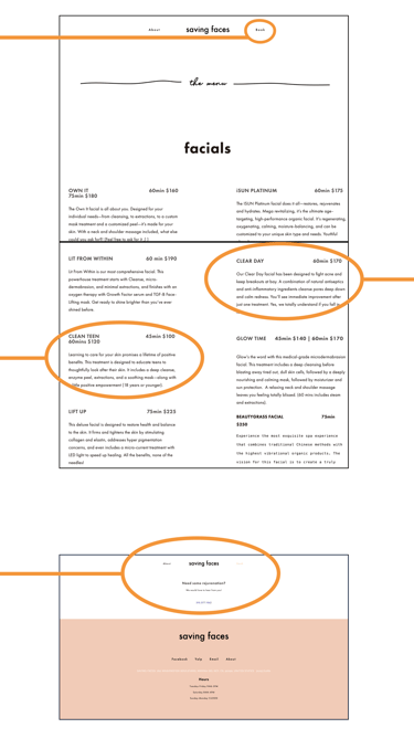
Based on our initial review of the website, the most significant issue is that the "Book" button at the top of the page is non-functional; it doesn't lead to any action or page. There are no pages linked to the "Book" button, making it completely ineffective.
3.Disorganized Service Navigation
The information about services is disorganized, and users are unable to click on the specific services they are looking for. This makes navigation difficult and frustrating.
2.Visual Content Deficiency
There are no pictures or videos to easily showcase the services to clients. Additionally, the content is overly long and text-heavy.
4.Reservation Page Issues
The reservation page is not working, preventing users from booking any services.
The address is not specified with any map or address-finding program.
"Home Page"
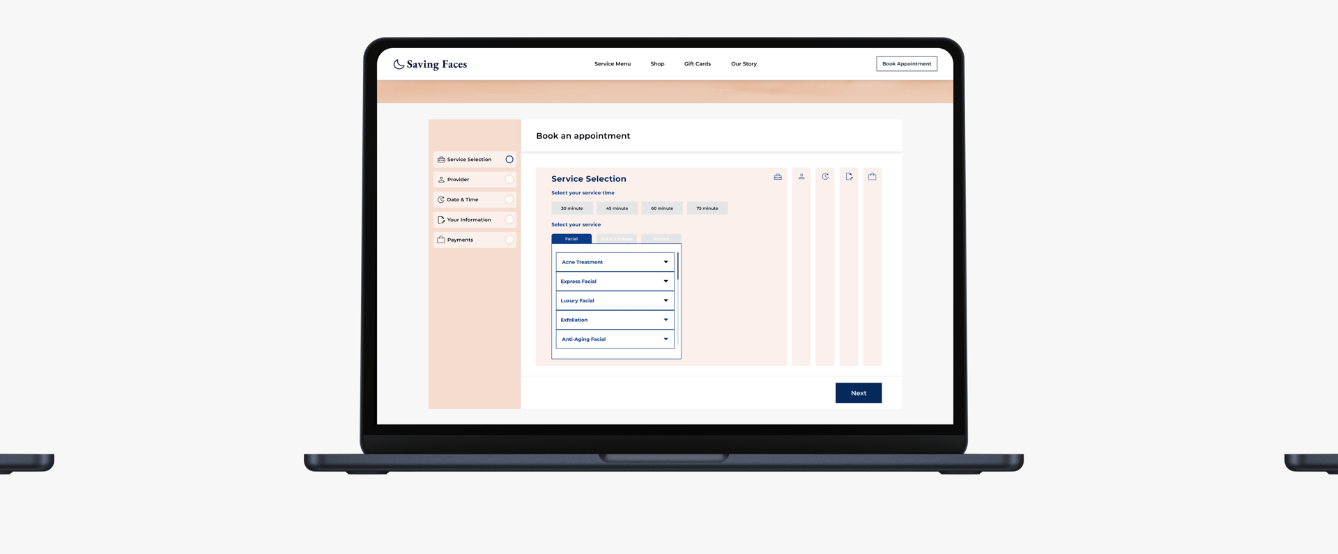
"Booking Page"
Visibility of System Status
Aesthetic &Minimalist Design
Consistency and Standards
Consistency and Standards
Key Takeaways
The "Book" button is non-functional, leading to no action or page.
Service information is disorganized, with no clickable links to specific services.
The website lacks visual content, such as pictures or videos, to showcase services.
The reservation page is broken, preventing users from booking services.
There is no map or address provided, making it difficult for users to locate the business.
Competitive Analysis
Analyzing our competitors helped us decide what should be on the homepage. It provided insights into the features, functions, and flows. As a result, we were able to identify opportunities for creating a product that would differentiate itself from the competition.


Online Booking
Shopping Products From Website
Service Categorization
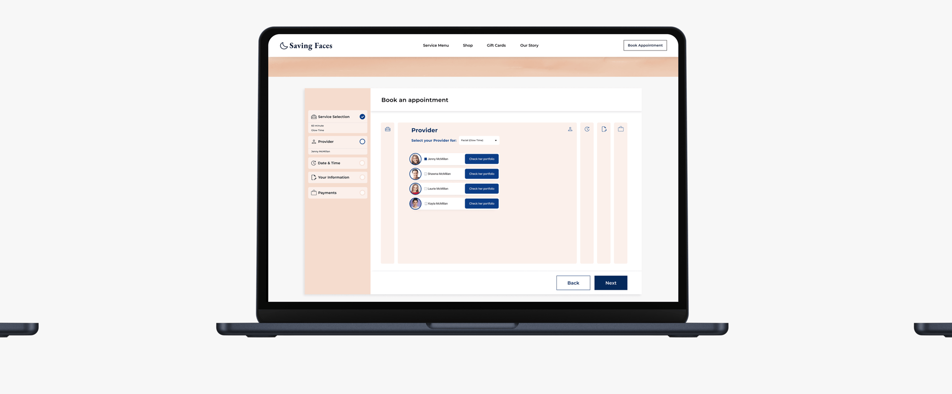
Select Providers
Key missing features
Key Takeaways
Reviewing competitors' features helped identify effective navigation strategies for the booking process.
Analyzing competitors' approaches to checkout design informed a streamlined and efficient process.
Examining competitors' review sections highlighted the importance of a well-organized customer review area.
Adopting a minimal and clear design was reinforced as a best practice for creating a user-friendly experience.
Online survey
To deepen our understanding of user preferences, we conducted a brief survey and collected insights from 83 respondents. Below are some key insights:


Key Takeaways
Reviews Matter: Participants emphasize the importance of reviews when selecting skincare services, facials, or operators.
Flexible Booking: Users prefer booking skincare services on an as-needed basis, highlighting the need for a user-friendly, on-demand booking system.
Operator Choice: Users value the option to choose their operator, making this a key feature to include.
User Stories & Key Findings
After presenting our Heuristic Evaluation to stakeholders, we further explored the business's social media channels, identifying gaps in the website's content. Our UX research revealed that the business offers skincare products and hosts workshops—neither of which were featured on the existing site. We consulted with the business owner, who welcomed the addition of these elements, along with positive Yelp reviews to enhance credibility.
We integrated these insights into our website redesign, creating User Stories to align with customer and business needs. These stories were organized by priority (high vs. medium) to focus on the most critical aspects first.
Increase Online Bookings:
As a business, I want to simplify the online booking process so that customers can easily schedule appointments, leading to an increase in bookings.Enhance Customer Satisfaction:
As a customer, I want to quickly find the service I need and complete the booking process efficiently so that my experience is smooth and satisfying.
High Priority
Feature Workshops: As a business, I want to prominently feature information about our workshops on the website so that customers are aware of these offerings and can easily sign up.
Add Reviews: As a business, I want to showcase customer reviews on the website so that potential clients can see positive feedback and build trust in our services.
Highlight Skincare Products: As a business, I want to add our skincare products to the website so that customers can view and purchase these items alongside our primary services.
Medium Priority
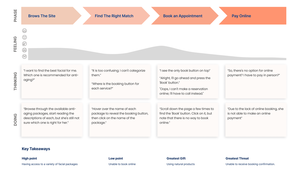
Customer journey map
To conclude our research, we also used a user journey map to analyze the current state of the booking process for facial services.
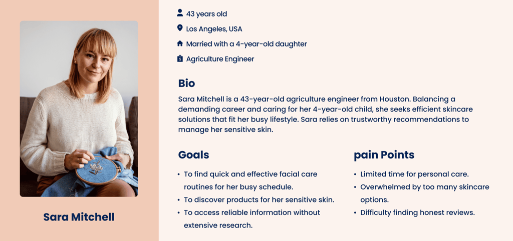
Persona
The insights I gained from researches leading up to the persona. The main goal is to display those patterns and pain points, which allowed me to further empathize with users.
Information architecture and card sorting
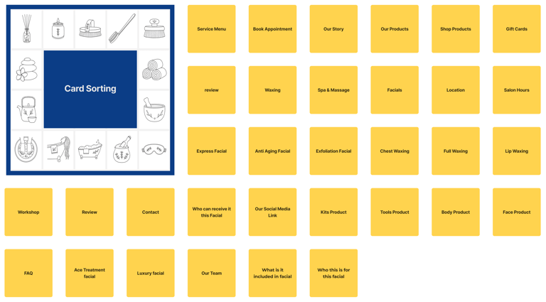
Card sorting: 33 cards and 15 responses
To optimize our website's navigation and improve user experience, we decided to utilize card sorting as a key research method. Initially, we conducted an open card sorting session where participants were asked to freely categorize various content items without any predefined structure. This approach provided a broad perspective on how users naturally group information, but the results were somewhat inconsistent and didn’t fully meet our expectations for a clear site structure.
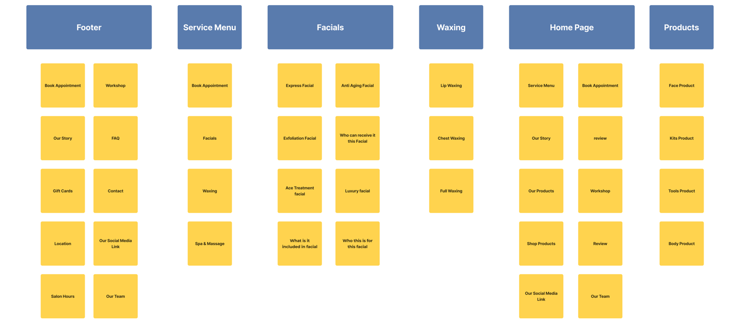
To address this, we followed up with a closed card sorting exercise. In this phase, we provided participants with specific categories and asked them to place the content items into these groups. This approach yielded more structured and actionable insights. Participants found it easier to categorize content, and their feedback helped us identify logical groupings and any overlaps in our initial design.
The combination of both open and closed card sorting sessions allowed us to refine our information architecture effectively, ensuring that the final design would be both intuitive and aligned with user expectations. This process was instrumental in creating a navigation system that enhanced usability and supported our overall design goals.
Site Map
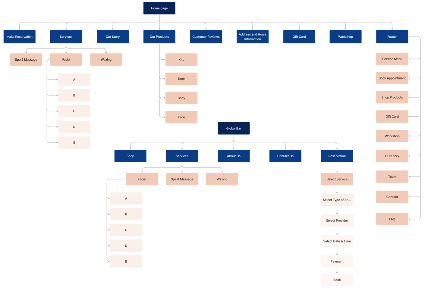

To ensure our information architecture meets user expectations, we conducted six open card sorting sessions using the Optimal Workshop platform. After the initial exercise, we developed our first version and iteratively refined it based on user testing and competitive analysis.
User flow and task flow


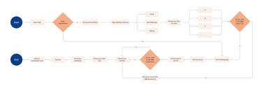
What redesign decisions did we make?
The most important takeaways from our research are challenges and solutions.
Challenge 1:
Correct Classification: Ensuring services were accurately categorized.
Avoiding Overload: Preventing users from being overwhelmed with too much detail.
Clear Navigation: Keeping navigation straightforward and intuitive.
Balancing Feedback: Aligning stakeholder feedback with user needs.
Solutions:
Initially, we categorized the services based on the existing descriptions, on the website. After presenting these categories to the stakeholders, we received feedback that some of the categories were not accurate. The stakeholder suggested additional categories that were very helpful.
Through Four meetings with the Stakeholder , we refined the Categories. We concluded that the Final categorization, Which addresses the high demand and variety of services on the website, best meets the needs of users and the business.
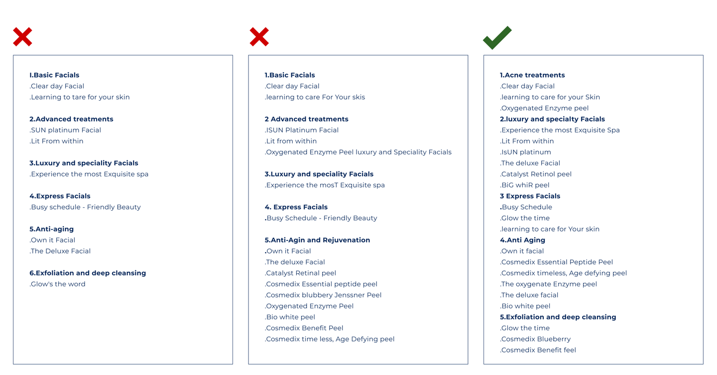
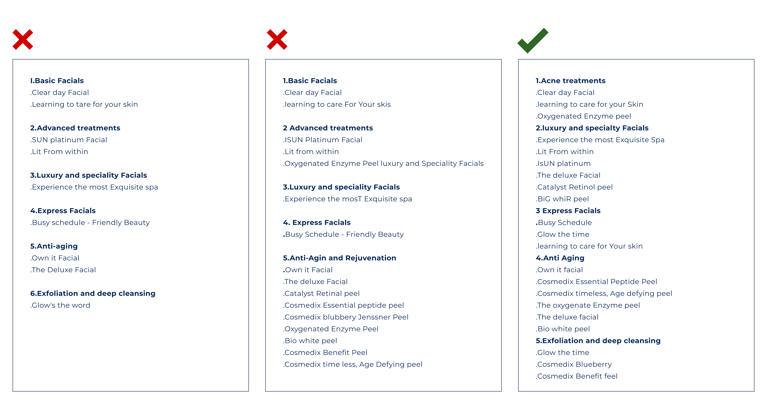
some services were mistakenly categorized as adds-ons.
Was not approved
some Items fit into two categories. Was not approved
Approved.
Challenge 2:
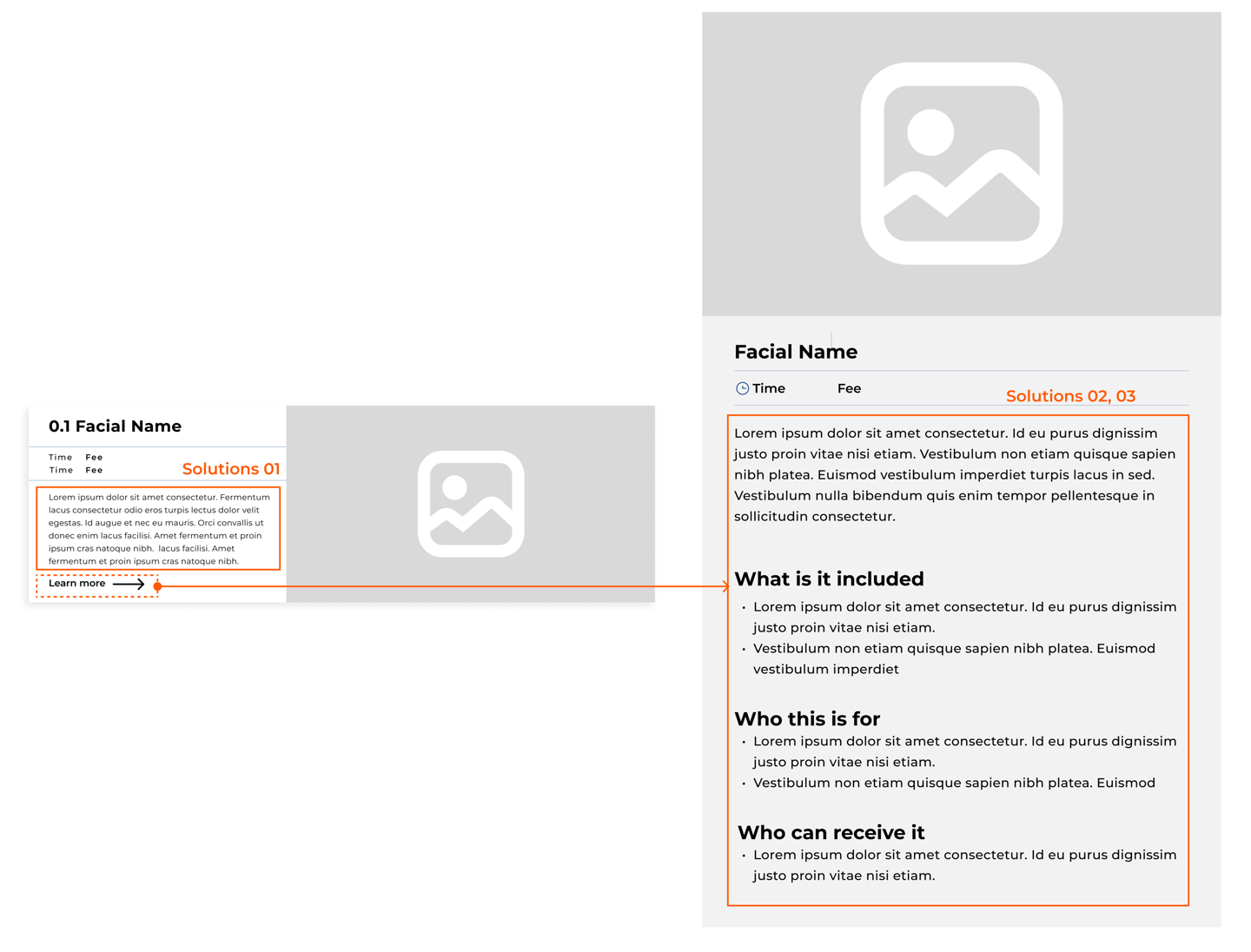
Users often call to confirm if the selected service is appropriate for their needs.
Reduce user uncertainty and improve Confidence in service selection.
Solutions:
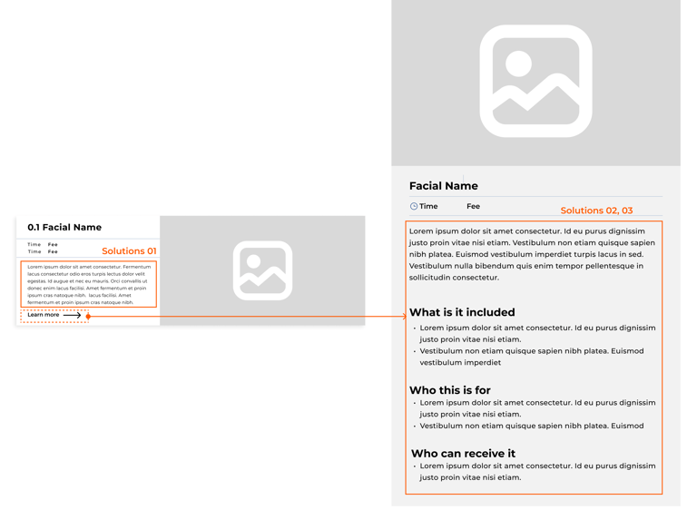
Added detailed service descriptions within the booking carts.
Provided extra information to guide users in choosing the most suitable services.
Implemented clear, accessible explanations to ensure users understand their choices.
Challenge 3:
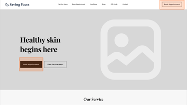
The original website's book button was not functional, making it difficult for users to schedule appointments. Additionally, the button was not easily accessible across different pages, creating frustration for users who wanted to book services quickly.
Solutions:
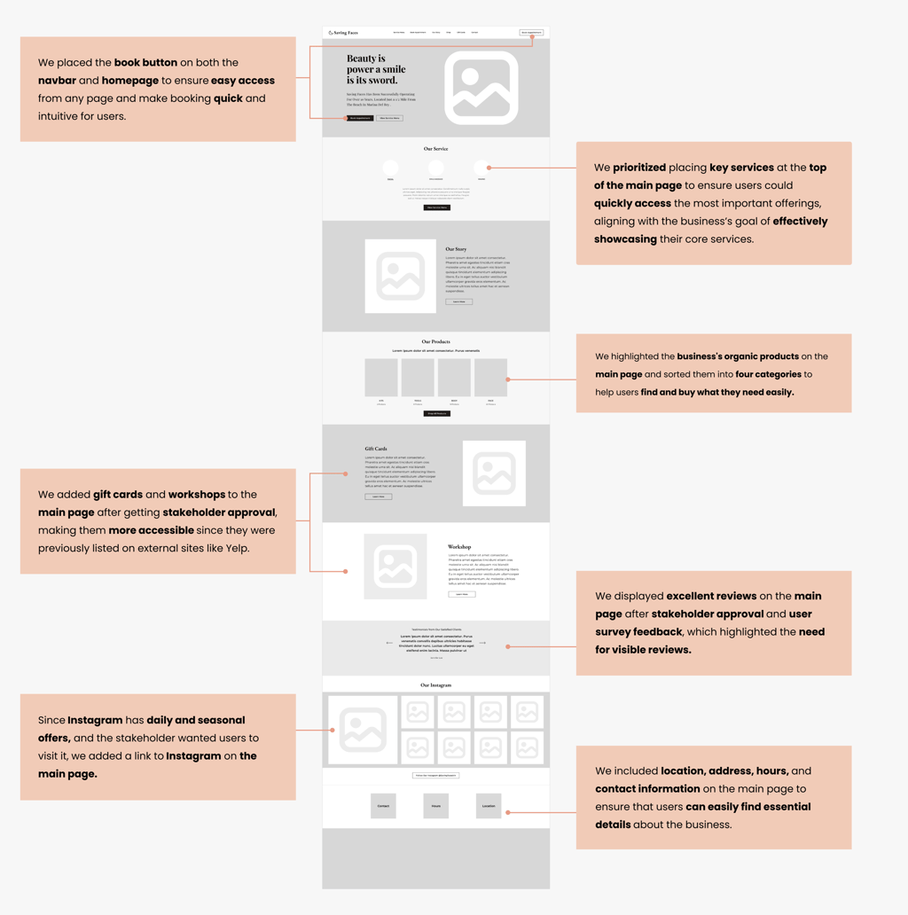
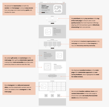
We resolved this by placing a functional book button on the navigation bar, ensuring it's prominently displayed and accessible on every page. This allows users to book appointments easily, regardless of where they are on the site.

"Home Page"
Challenge 4:
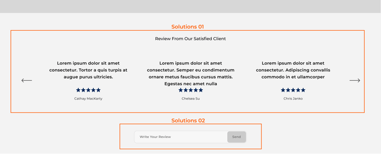
Users needed visible reviews to make informed decisions, and the stakeholder wanted to showcase the website's positive feedback.
Solutions:
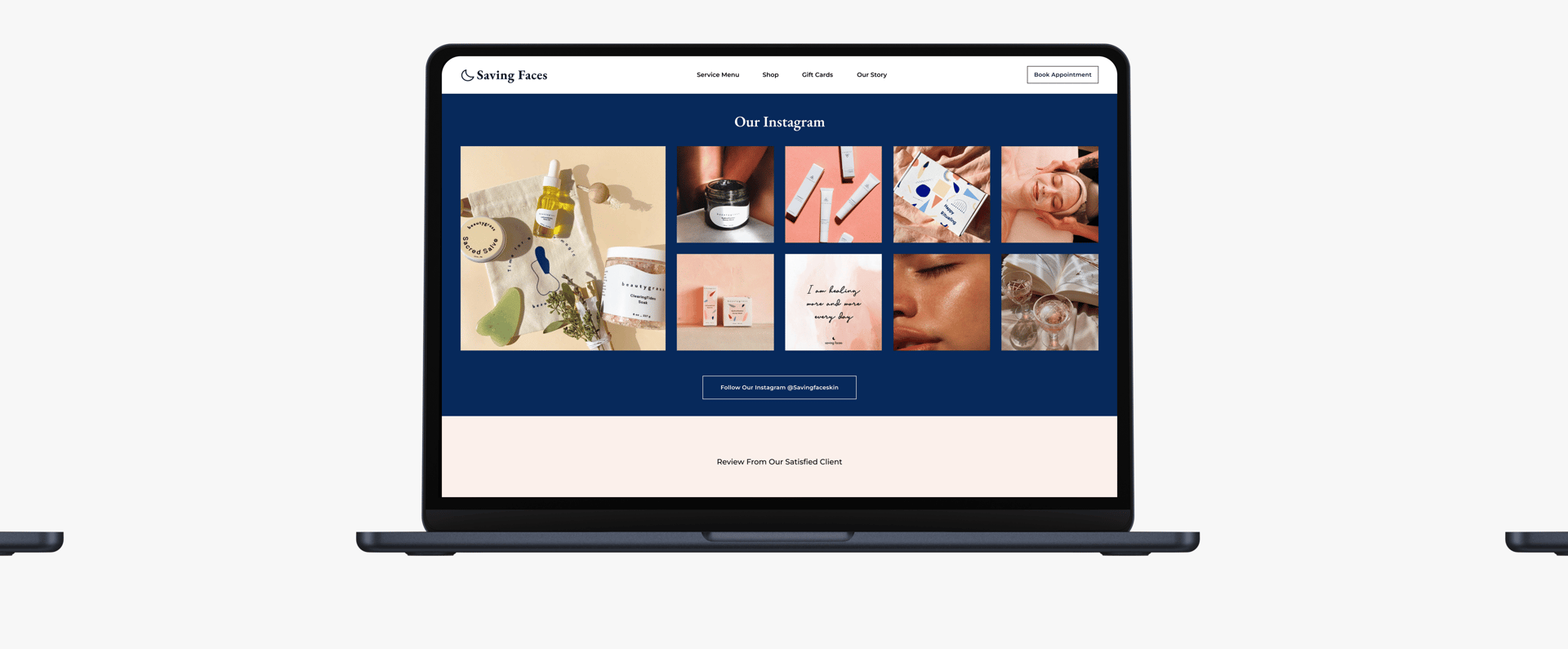
Displayed prominent reviews on the main page to enhance visibility and address user feedback.
Added a detailed space on the website where users can easily write and share their own reviews, enhancing user engagement and providing valuable.
"Home page"
Mid-Fid Wireframe
Color Exploration and Inspiration
The next step for us was Color Exploration. The Saving Faces stakeholders wanted to maintain the dark blue and peach colors that were already on their Salon and product packaging, but were open to exploring new colors and combinations. Our team explored different color palettes, some included their signature colors and others explored a more natural and earthy tone that was popular among other facial brands.
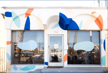
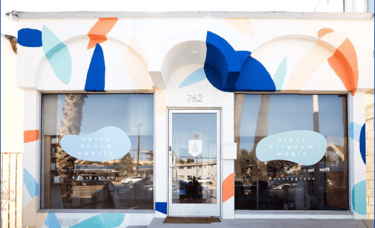
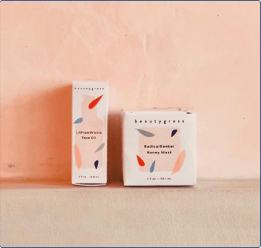
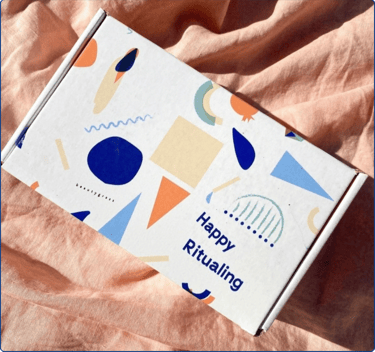
Saving Faces Salon & Product Packaging


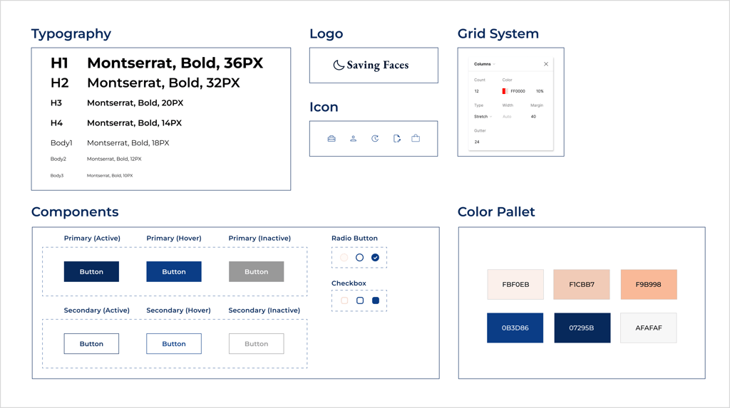
We developed a complete UI kit to serve as a reference for templates and components. This kit ensures that interface development is smooth, consistent, and efficient throughout the project.
UI Kit
Finalizing and Delivering the Page Layouts


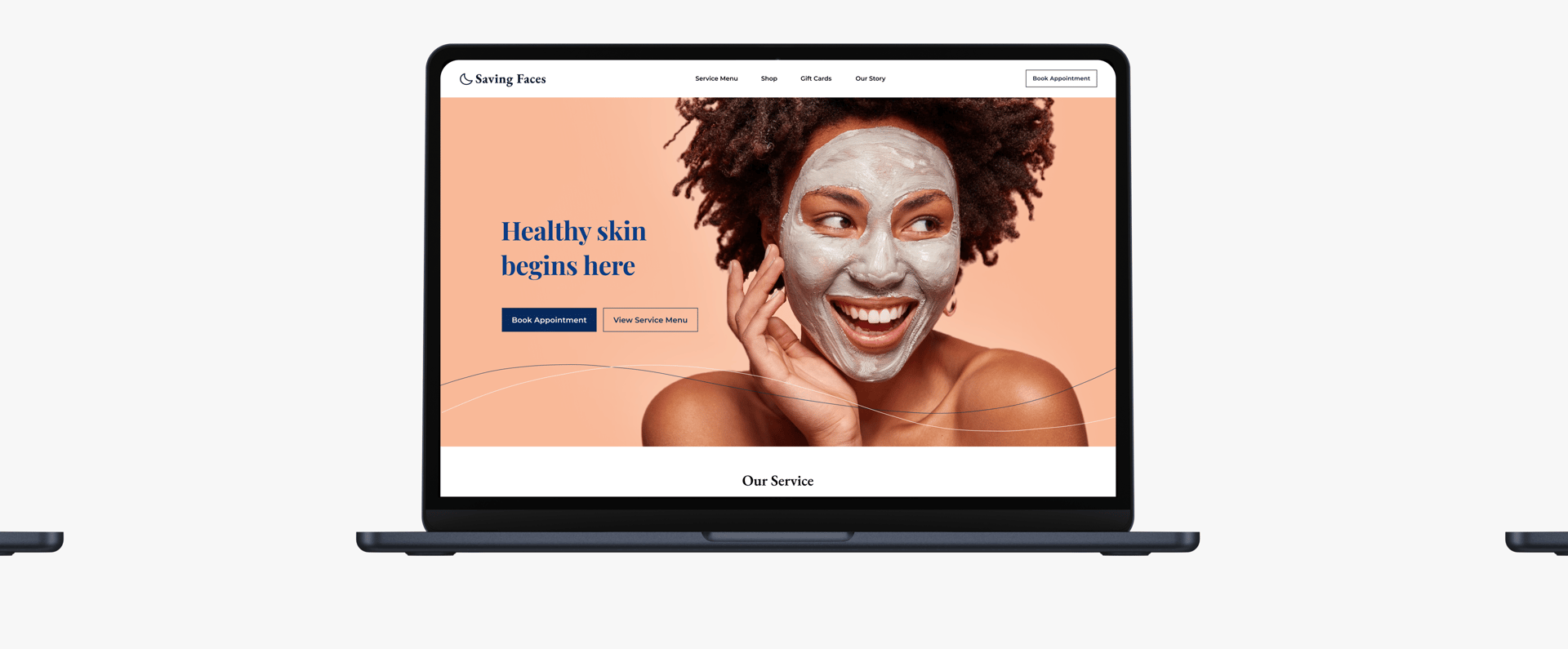
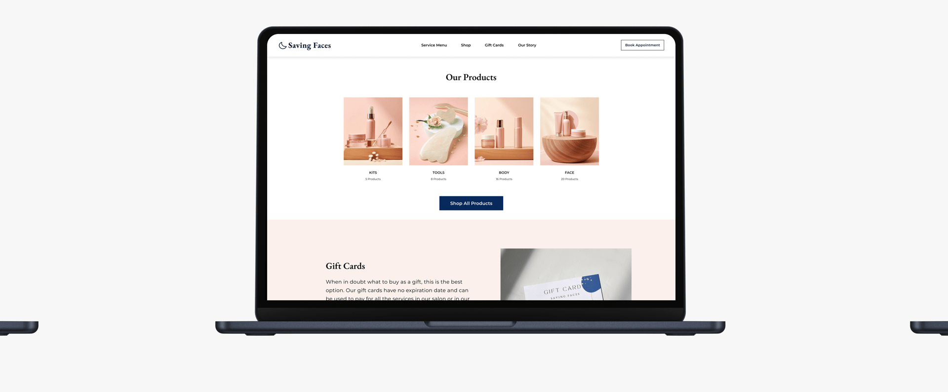
Home page
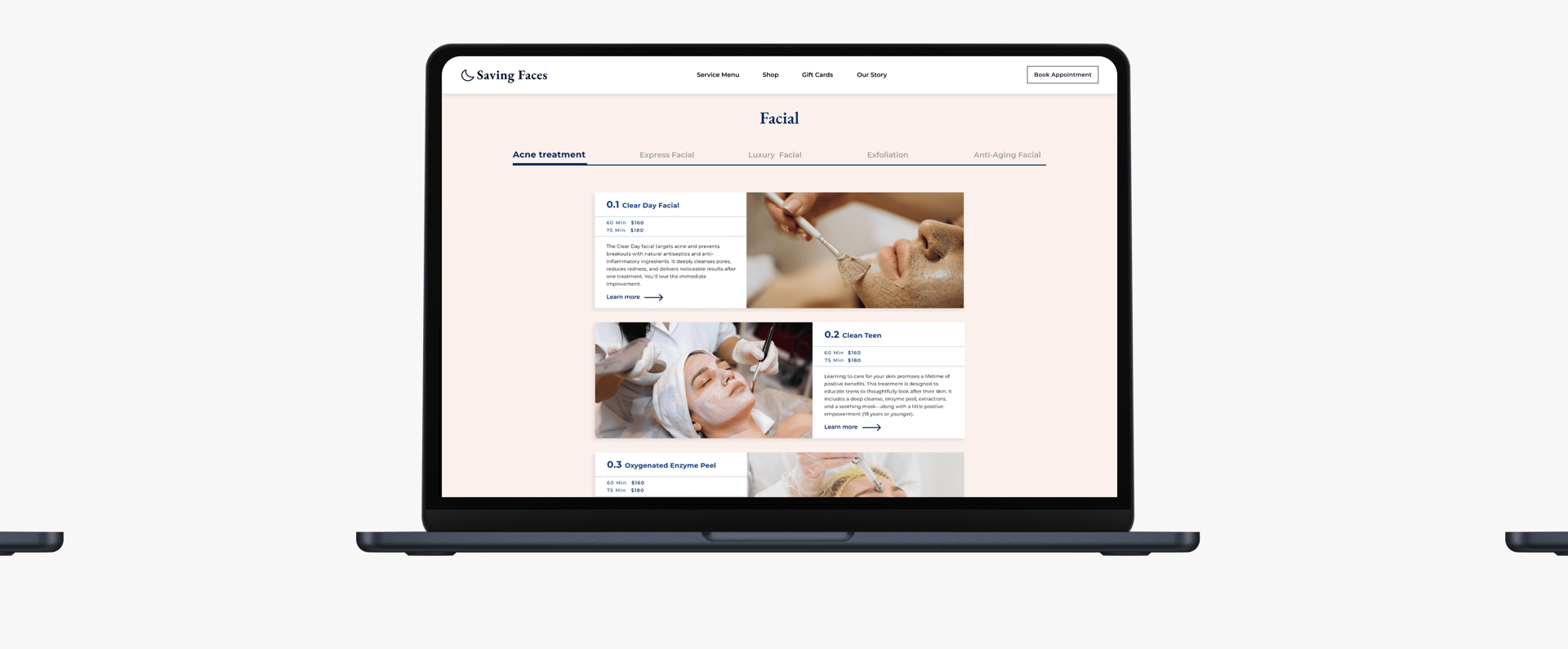
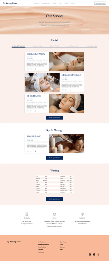
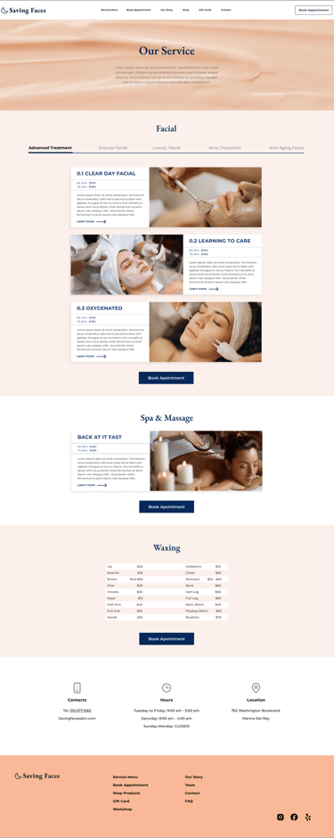
Service Page
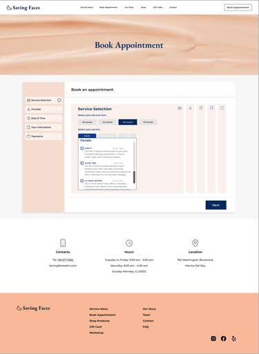
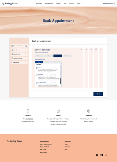
Booking Page
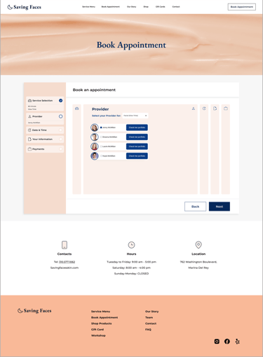
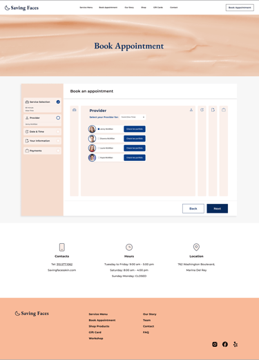

Choosing Operator Page
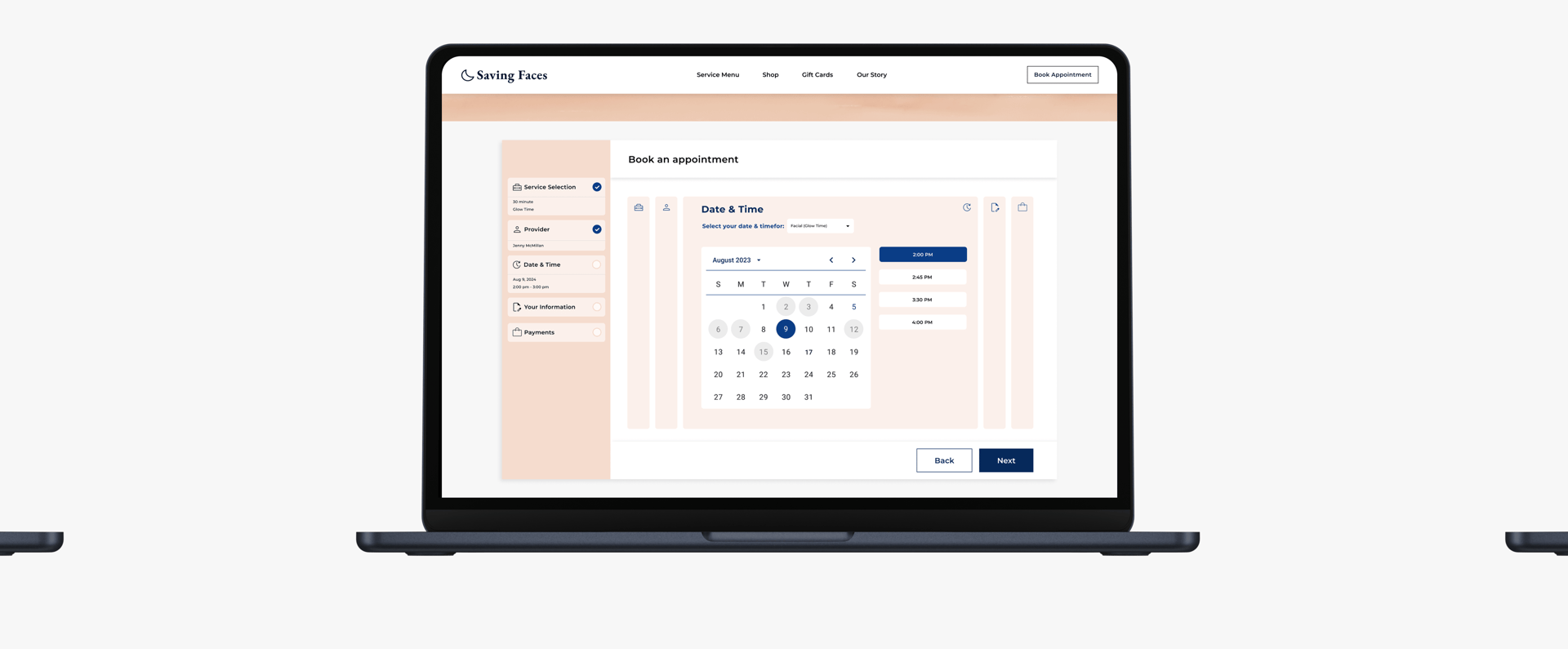
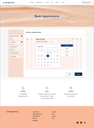
Choosing Date & Time Page
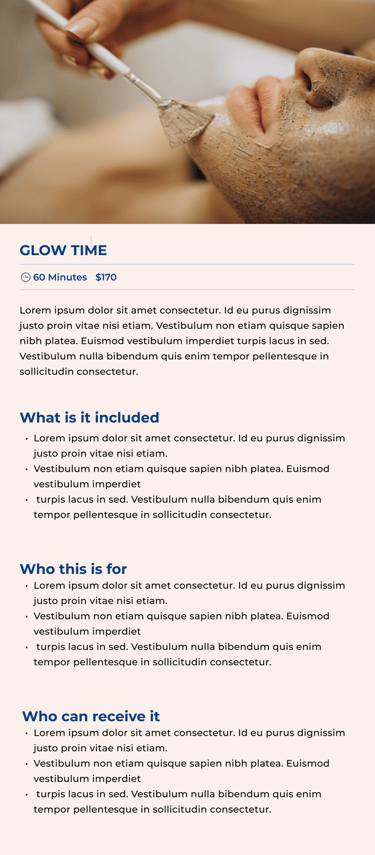
Service Learn More Pop Up
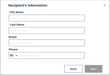
Recipient's Information pop up
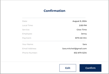
Confirmation pop up Page
Prototype
Here is the last prototype, displaying what we've achieved through our design process.


