Making 1,500+ listings feel like one clear decision.
Residential, commercial, and parking. Three completely different renters, one website. I designed the search that gets each of them to the right space and to the next step once they find it.
CASE STUDY .


CLIENT
Olympus Property Management Ltd.
Product Designer End-to-End UX/UI
5 People
May - Sep 2026
MY ROLE
TEAM
DURATION
STATUS
Shipped - live site
OLYMPUS PROPERTY MANAGEMENT . NOVA SCOCIA
Making 1,500+ listings feel like one clear decision.
Residential, commercial, and parking. Three completely different renters, one website. I designed the search that gets each of them to the right space and to the next step once they find it.
CASE STUDY .
CLIENT
Olympus Property Management Ltd.
Product Designer End-to-End UX/UI
5 People
May - Sep 2026
MY ROLE
TEAM
DURATION
STATUS
Shipped - live site
OLYMPUS PROPERTY MANAGEMENT . NOVA SCOCIA
I OWNED
MY ROLE
Client interviews and synthesis
Competitive teardown
AI and sitemap
User flows and wireframes
Usability test plans and moderation
Search, listing, property and residents UI
Component and pattern decisins


I SHARED
Scope and prioritization with the team
Feasibility and build sequencing with developers
Content and copy review with the client

A team of five delivered this site. I was the UX designer from kickoff through the research, the information architecture, the flows, and the testing, and once the structure was settled, I carried those same decisions into the interface.
I came in as the UX designer and stayed through the UI.
" I'm looking for a place "


BECOMES
" This is the one "
THE REAL PROBLEM

The challenge was never putting more properties online. It was designing the distance between those two sentences.
THE INSIGHT
One search can't answer three different questions.


Same inventory, four different first questions. A filter can't hold that difference, so property type stopped being a filter and became the thing that reconfigures the search.
WHERE THE ANSWER CAME FROM
I went looking for a pattern to borrow. There wasn't one.
The Business, not the brief.
01 . CLIENT SESSIONS
Rentals.ca, Apartments.com, RentFaster, Renters.ca: I pulled apart how each one handles search, filtering, map interaction and the listing page. They set the baseline renters expect. But every one of them is built for a single kind of renter. None had to make one search serve four.


02 . COMPETITIVE TEARDOWN
Four Platforms, one blind spot
Sessions with the Olympus team to learn how they actually operate, what each property type is, how offers and promotions work, and who handles a renter once they get in touch. This is where the four-property-type problem surfaced, and where the shape of the whole search came from.


THE INSIGHT
So I stopped designing pages and designed a path.


KEY DESIGN DECISIONS
Six decisions along the path.
01 Search
02 Narrow
03 Say no early
04 Explore
05 Deside
06 Hand off
Search starts before the listings do.
THE TRADE-OFF
Four fields, not twelve. Depth lives downstream, where people have context for it.
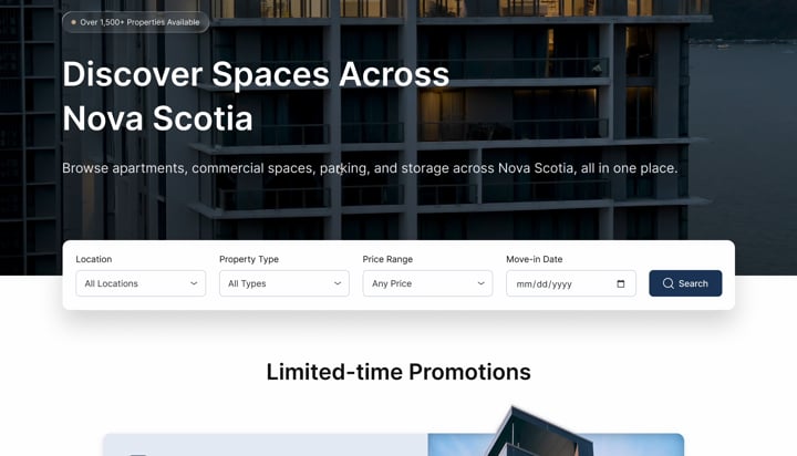
Four inputs instead of a browse-everything grid. Each is a question the renter already has an answer to, so the first interaction is never a guess.
01
SEARCH


Search starts before the listings do.
The tradeoff: four fields, not twelve. Depth lives downstream, where people have context for it.
Four inputs on the homepage instead of a browse-everything grid. 1,500+ listings sit behind one question: location, property type, price, move-in date enough to turn an inventory into a shortlist in a single interaction, and nothing more.
01
SEARCH


Each field answers a question the renter already has an answer to so the first interaction is never a guess.
One switch changes the entire search.
THE DETAIL THAT MATTERS
Applied filters are removable chips, not a count; the state of a search is always readable.
Property type is a mode, not another filter. Switching to Commercial or Parking swaps the filter set, the card content, and the language of the results.
02
NARROW


Everything else collapses into one All Filters panel. Applied filters stay pinned at the top, and the result count lives on the button that closes it; nobody loses track of why they're looking at 128 properties.


Residential — Beds & Baths, Home Type, Price per Plan.
Commercial — same control, now Square Feet and Commercial Type.
USABILITY TESTING . IT CHANGED DECISION 02
I designed it for the top of the page. People were at the bottom of it.
Several
ROUNDS
~15


One per major section of the flow
PEOPLE
Participants in each round
FORMAT
Task-based
Find a space, narrow it, decide


BEFORE
AFTER
Two rows — Every type visible but the tallest possible sticky header.
One row — Type reads as the mode you're in, and the view toggle earns a place.
The client called them limitations. Renters call them dealbreakers.
Olympus buildings are smoke-free, pet-free, and long-term. In our sessions, this came up apologetically, as something the website would have to work around. But for someone with a dog, it isn't a footnote; it's the whole answer. Finding out three clicks into an application wastes their time and the leasing office's.
03
SAY NO EARLY . FROM THE INTERVIEW


Long-Term Rentals
Smoke-Free
Pet Free
The policies moved to the top of the search results, stated plainly. Saying no early is a service; it costs one row of the
page and saves someone an application.
THE CALL
One switch changes the entire search.
Applied filters are removable chips, not a count the state of a search is always readable.
Property type is a mode, not another filter. Switching to Commercial or Parking swaps the filter set, the card content, and the language of the results. Everything else collapses into one All Filters panel with applied filters always visible, so nobody loses track of why they're looking at 128 properties.
02
NARROW


Residential, Commercial, Parking: one control, three search models.


Applied filters stay pinned at the top, and the result count lives on the button that closes the panel.
Location isn't a field. It is the decision.
THE REFRAME
Distance isn't always measured in kilometres. Sometimes it's measured in minutes.
A property can look perfect on paper, but then you see where it is. Map and list run side by side: the map gives context, the list gives detail; neither wins. Three layers let renters ask, “Where is this, really?”
04
EXPLORE

What’s around it?
Campuses, transit, groceries, schools, and parks are layered onto the map on demand, so a neighbourhood becomes legible without leaving the search.


A
How long to get there?
Distance isn’t always measured in kilometres; sometimes it’s measured in minutes. Set a destination, choose how you travel, and see only places within a time that works for you.


B


Draw your own boundary
Some people don’t think in neighbourhood names. Drawing an area on the map lets the search follow a mental map instead of an administrative one.
C
Location isn't a field. It is the decision.
Distance isn't always measured in kilometres, sometimes it's measured in minutes.
Three ways to ask "Where is this, really?" A property can look perfect on paper. Then you see where it is. The map and the list run side by side; the map gives context, the list gives detail, and neither one wins. Three layers let the renter ask "where is this, really?" through neighbourhoods, commute times, or a hand-drawn boundary.
03
EXPLORE


The property page answer the questions a viewing would.
Pricing is grouped by plan and unit rather than shown as a single range, so "from $1,600" never turns into a surprise. Utilities, availability dates, floor plans, and tours sit on the same card as the price. The contact panel names the superintendent, their hours, and their number.
05
DECIDE


Renting is rarely a solo decision.
So Save and Share sit inline with the gallery rather than buried in an account area, keep it for later, or send it to whoever else has a vote.


The property page answer the questions a viewing would.
Pricing is grouped by plan and unit rather than shown as a single range, so "from $1,600" never turns into a surprise. Utilities, availability dates, floor plans, and tours sit on the same card as the price. The contact panel names the superintendent, their hours, and their number.
04
DECIDE
A trust problem disguised as a link.
AFTER
Residents pay rent and file maintenance requests through RentCafe, a third- party portal. Clicking through dropped them onto an unfamiliar domain, and people hesitated. It was the moment the site stopped feeling like Olympus.
06
HAND OFF


The call: don't hide the third party. Introduce it before anyone leaves the site
BEFORE


The moment the site stopped feeling Olympus.
A trust problem disguised as a link.
Residents pay rent and file maintenance requests through RentCafe, a third-party portal. Clicking through dropped them onto an unfamiliar domain, and people were hesitating. The call: don't hide the third party. Introduce it. A dedicated Residents page explains what the portal does before anyone leaves the site.
05
HANDOFF
FROM THE INTERVIEW
The client called them limitations. Renters call them dealbreakers.
Olympus buildings are smoke-free, pet-free, and let on long-term terms. In our sessions, this came up the way constraints usually do, apologetically, as something the website would have to work around. But for someone with a dog, that isn’t a footnote; it’s the whole answer. Finding it out three clicks into an application wastes their time and the leasing office ’s. So the policies moved to the top of the search results, stated plainly.

Long-Term Rentals
Smoke-Free
Pet Free
Saying no early is a service. It costs one row of the page and saves someone an application.
USABILITY TESTING
I designed it for the top of the page. People were at the bottom of it.


After
Before


Two rows. Every type visible, but the tallest possible sticky header.
One row. Type reads as the mode you’re currently in, and the view toggle earns a place.


RESPONSIVE
On a phone, the map and the list can't both win.
The desktop layout depends on two panes being visible at once. On mobile, that becomes a choice, so the view toggle becomes the primary control, and the search collapses into stacked fields in a single sheet.
Filters move into a full-height sheet with the result count on the closing button, and the policy strip stays above the results; it’s the one thing that shouldn’t need a tap to find.


Homepage search, stacked.
Map and list as one switch.
Filters in a full-height sheet.
Property page and contact card.
WORKING WITH THE DEVELOPERS
The hard part to hand over wasn't the layout.
It was the logic.


BEYOND SEARCH
Not every visit starts with a property.
Some people arrive with a question, a job in mind, or simply wanting to know who Olympus is. These pages give those visitors a clear path too.


Contact
Making the right team easy to reach.


FAQ
Answering common questions before they become friction.
Our Story
Building trust and introducing the company.
REFLECTION
Three things this project taught me.
01
Test assumptions, not just interfaces.
Research coverage should match product complexity.
Business constraints can become user value.
The type row looked clear in a static frame, but people overlooked it in context. I redesigned around real browsing behaviour, not visual completeness.
02
03
Smoke-free and pet-free looked like things to minimize. Surfaced early, they became decision- making information, clarity without added complexity.
Testing mostly represented residential renters. Next cycle, I'd test commercial and parking journeys on their own before scaling the patterns.

Test assumptions, not just interfaces.
The property-type row looked clear in the static design, but usability testing revealed that users overlooked it in context. I redesigned the discovery experience around actual browsing behavior rather than visual completeness, reinforcing the importance of validating assumptions early.
01

Business constraints can become user value.
Smoke-free and pet-free requirements initially appeared as constraints to minimize. Instead, I reframed them as decision-making information and surfaced them earlier in the experience. A small design change improved clarity without adding complexity to the product.
02
Research coverage should match product complexity.
Our usability testing primarily represented residential renters, while the platform also serves commercial and parking users. Rather than assuming the same behavior across audiences, I identified this as a validation gap. In the next research cycle, I would test these journeys independently before scaling the patterns across the platform.
03
Olympus is live. Have a look, or ask me anything about it.