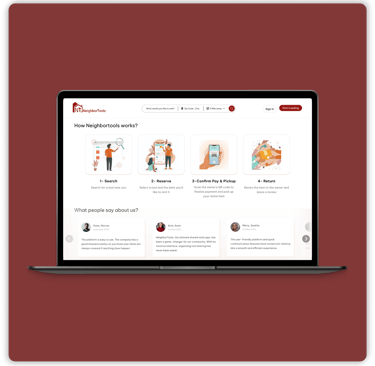
The Olympus Admin Dashboard is an internal property management platform designed to help administrators efficiently manage and organize property listings across Residential, Commercial, and Parking categories. The goal was to streamline complex administrative workflows, making it easier to add, edit, categorize, and maintain property information in one centralized system. I led the end-to-end UX/UI design process, focusing on creating an intuitive, structured, and scalable dashboard experience that simplifies property management and improves operational efficiency.
Project Overview


Olympus Admin Dashboard
One place to run 1,500+ listings
Olympus moved from a third-party listing platform to a website of its own. This is the dashboard behind it, where one admin adds every property, keeps every contact right, runs every promotion and finally sees how renters behave.
MY ROLE
Product Designer (UX/UI)
8 Weeks
5 People
Rental website . Custom CMS . Analytic dashboard
TIMELINE
TEAM
DELIVERABLES


Olympus rents homes, commercial spaces and parking in Nova Scotia. Its old platform, RentCafe, no longer fit the business.
Why the team needed a new CMS


They wanted two things: a rental website for applicants and an admin panel the team could run themselves.


Before this project, Olympus had no website of its own. Properties sat on RentCafe, a third-party platform where renters browsed and applied. We designed the public site (see that case study) and, behind it, the dashboard that runs it.
Olympus's listings lived on someone else's platform.


Our client contact was the person who would use the dashboard every day. Every screen we designed traces back to one of these requests.
One meeting with the admin gave us five goals. They became our brief.


Below are the five specific problems that came out of this question, and the approach I chose for each.
The goals came first. Four more decisions came out of the design work itself, and a week of real use confirmed the structure before launch.
From one meeting to a dashboard in daily use.


Organizing the menu
around workflows


Editing a property
was one endless form


Four details keep the user oriented and in control:


The tab bar up close: counts show what's filled in, and the Published switch sits right beside the tabs.


Less typing in the tabs the team uses most


The team didn't know what
visitors did on the site


Numbers on these screens are a snapshot from the live panel at the time of capture. They show how the dashboard reads, not a claim about the site's performance.
Duplicate requests that had
to be cleaned up by hand


The limits up close: every field explains its unit in plain words, with a short "How it works" note beside it.


Each form type is checked on its own, so a renter can still ask about another property.
The team can change these limits in the CMS, from 1 to 365 days per form.


“Where do we enter each property's superintendent?”


After handoff, the Olympus team took over updating content, properties and promotions themselves. But this question arrived soon after.


The feature had been in the CMS from the start. The problem was that they couldn't find it.
Why couldn't they find it? Two small decisions of mine:
The feature was technically correct; its wording and presentation didn't match how users think.
We didn't test it with a script. We gave it a week of real work.


Designers and the developer walked the admin through the whole dashboard in one meeting. Then the admin used it alone for a week, with real data and a brief that pushed every corner of the system.


What this dashboard taught me.